material-components-android
Badges
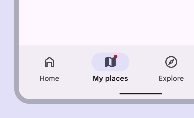
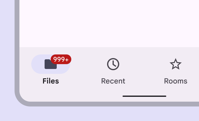
Badges show notifications, counts, or status information on navigation items and icons. There are two variants of badges.
 |
 |
|---|---|
| 1 | 2 |
- Small badge
- Large badge
Note: Images use various dynamic color schemes.
Design & API documentation
Anatomy
- Small badge
- Large badge container
- Large badge label
More details on anatomy items in the component guidelines.
Key properties
BadgeDrawable Attributes
| Feature | Relevant attributes |
|---|---|
| Color | app:backgroundColor app:badgeTextColor |
| Width | app:badgeWidth app:badgeWithTextWidth |
| Height | app:badgeHeight app:badgeWithTextHeight |
| Shape | app:badgeShapeAppearance app:badgeShapeAppearanceOverlay app:badgeWithTextShapeAppearance app:badgeWithTextShapeAppearanceOverlay |
| Label | app:badgeText (for text) app:number (for numbers) |
| Label Length | app:maxCharacterCount (for all text) app:maxNumber (for numbers only) |
| Label Text Color | app:badgeTextColor |
| Label Text Appearance | app:badgeTextAppearance |
| Badge Gravity | app:badgeGravity |
| Offset Alignment | app:offsetAlignmentMode |
| Horizontal Padding | app:badgeWidePadding |
| Vertical Padding | app:badgeVerticalPadding |
| Large Font Vertical Offset | app:largeFontVerticalOffsetAdjustment |
| Badge Fixed Edge | app:badgeFixedEdge |
Note: If both app:badgeText and app:number are specified, the badge
label will be app:badgeText.
Code implementation
Before you can use Material badges, you need to add a dependency to the Material components for Android library. For more information, go to the Getting started page.
Note: This component is still under development and may not support the full range of customization Material Android components generally support, for instance, themed attributes.
A BadgeDrawable represents dynamic information such as a number of pending
requests in a BottomNavigationView or
TabLayout.
Adding badges
- Small badge on a navigation item
- Large badge on a navigation item
- Large badge with max characters on a navigation item
API and source code:
BadgeDrawableBadgeUtils
Create an instance of BadgeDrawable by calling create(Context) or
createFromAttributes(Context, AttributeSet, int, int)}.
The approach used to add and display a BadgeDrawable on top of its anchor view
depends on the API level:
In API 18+ (APIs supported by ViewOverlay)
- Add
BadgeDrawableas a ViewOverlay to the desired anchor view. - Update the
BadgeDrawable’s coordinates (center and bounds) based on its anchor view using#updateBadgeCoordinates(View).
Both steps have been encapsulated in a util method:
BadgeUtils.attachBadgeDrawable(badgeDrawable, anchor);
In Pre API-18
- Set
BadgeDrawableas the foreground of the anchor view’sFrameLayoutancestor. - Update the
BadgeDrawable’s coordinates (center and bounds) based on its anchor view, relative to itsFrameLayoutancestor’s coordinate space.
Option 1: BadgeDrawable will dynamically create and wrap the anchor view in a
FrameLayout, then insert the FrameLayout into the original anchor view
position in the view hierarchy. Same syntax as API 18+
BadgeUtils.attachBadgeDrawable(badgeDrawable, anchor);
Option 2: If you do not want BadgeDrawable to modify your view hierarchy, you
can specify a FrameLayout to display the badge instead.
BadgeUtils.attachBadgeDrawable(badgeDrawable, anchor, anchorFrameLayoutParent);
BadgeDrawable gravity modes
BadgeDrawable offers two gravity modes to control how the badge aligns with
its anchor view. By default, (TOP_END) badge aligns with the top and end edges
of the anchor (with some offsets). Alternatively, you can use TOP_START to
align the badge with the top and start edges of the anchor. Note that
BOTTOM_START and BOTTOM_END are deprecated and not recommended for use.
BadgeDrawable placement and offsets
By default, BadgeDrawable is aligned with the top and end edges of its anchor
view (with some offsets if offsetAlignmentMode is legacy). Call
setBadgeGravity(int) to change it to one of the other supported modes. To
adjust the badge’s offsets relative to the anchor’s center, use
setHorizontalOffset(int) or setVerticalOffset(int)
Regardless of offsets, badges are automatically moved to within the bounds of its first ancestor view that does not clip its children, to ensure that the badge is not clipped if there is enough space.
TalkBack support
BadgeDrawable provides a getter for its content description, which is based on
the displayed number or text (if any). To specify the content description, the
developer is provided with the following methods:
setContentDescriptionForText(CharSequence)
setContentDescriptionQuantityStringsResource(@PluralsRes int)
setContentDescriptionExceedsMaxBadgeNumberStringResource(@StringRes int)
setContentDescriptionNumberless(CharSequence)