material-components-android
Tabs
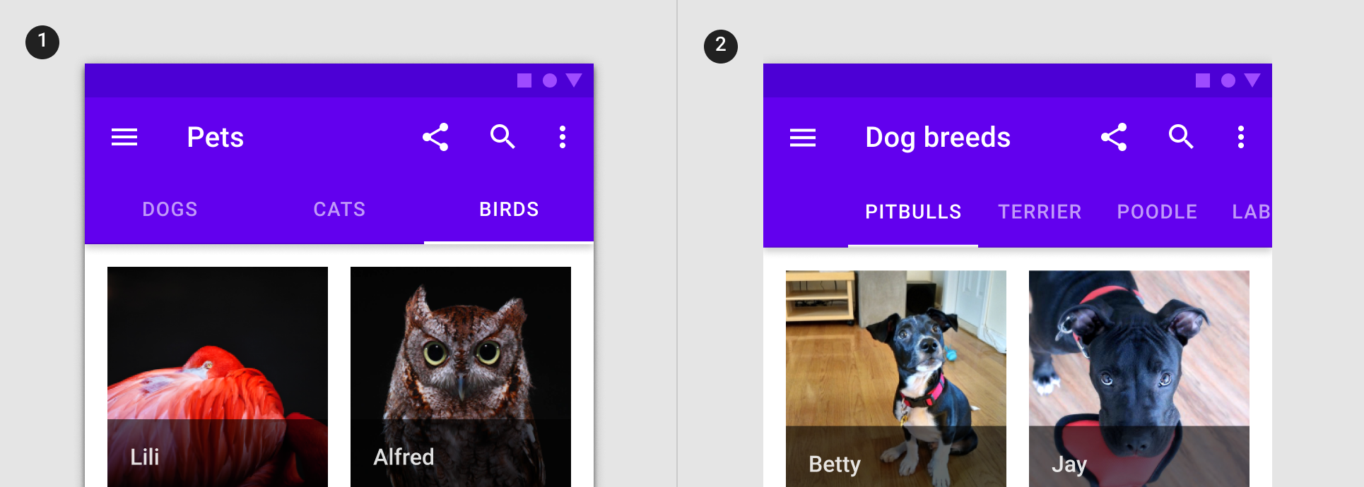
Tabs organize content across different screens, data sets, and other interactions. There are two variants of tabs.
- Primary tabs
- Secondary tabs
Primary tabs are placed at the top of the content pane under an app bar. They display the main content destinations.
Secondary tabs are used within a content area to further separate related content and establish hierarchy.
Note: Images use various dynamic color schemes.
Design & API documentation
Anatomy
Primary tabs
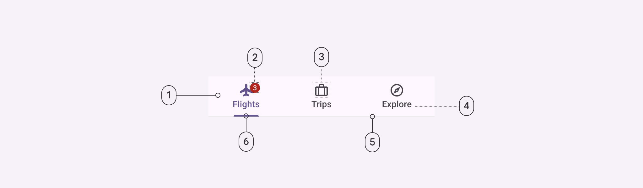
- Container
- Badge (optional)
- Icon (optional)
- Label
- Divider
- Active indicator
Secondary tabs
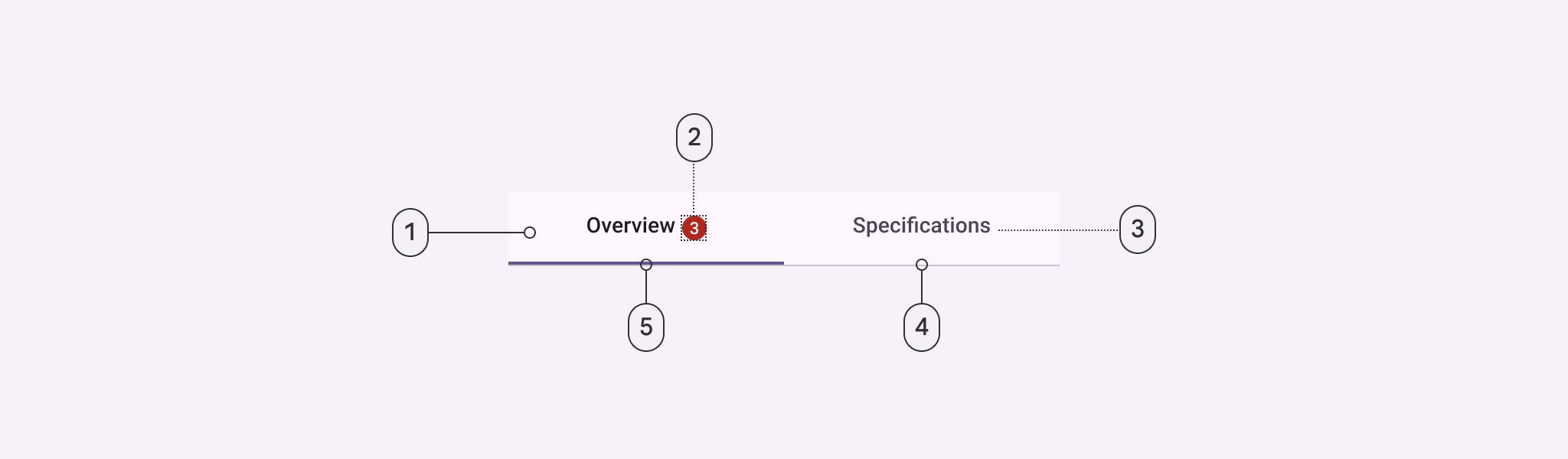
- Container
- Badge (optional)
- Label
- Divider
- Active indicator
More details on anatomy items in the component guidelines.
Key properties
Container attributes
| Element | Attribute | Related method(s) | Default value |
|---|---|---|---|
| Color | android:background |
setBackgroundgetBackground |
?attr/colorOnSurfaceVariant |
| Elevation | android:elevation |
setElevation |
0dp |
| Height | N/A | N/A | 48dp (inline text) or 72dp (non-inline text and icon) |
| Tab mode | tabMode |
setTabModegetTabMode |
fixed |
Tab item icon attributes
| Element | Attribute | Related method(s) | Default value |
|---|---|---|---|
| Icon | android:icon |
setIcongetIcon |
null |
| Color | tabIconTint |
setTabIconTintsetTabIconTintResourcegetTabIconTint |
colorOnSurfaceVariant and colorPrimary (activated) (see all states) |
Tab item text label attributes
| Element | Attribute | Related method(s) | Default value |
|---|---|---|---|
| Text | android:text |
setTextgetText |
null |
| Color | tabTextColor |
setTabTextColorsgetTabTextColors |
colorOnSurfaceVariant and colorPrimary (activated) (see all states) |
| Typography | tabTextAppearance |
N/A | ?attr/textAppearanceTitleSmall |
| Active tab typography | tabSelectedTextAppearance |
N/A | None; will use tabTextAppearance instead |
| Inline label | tabInlineLabel |
setInlineLabelsetInlineLabelResourceisInlineLabel |
false |
Note: When using tabSelectedTextAppearance, you must have matching text
attributes in tabTextAppearance to avoid unintended behavior.
Tab item container attributes
| Element | Attribute | Related method(s) | Default value |
|---|---|---|---|
| Ripple color | tabRippleColor |
setTabRippleColorsetTabRippleColorResourcegetTabRippleColor |
colorOnSurfaceVariant at 16% opacity and colorPrimary at 16% opacity (activated) (see all states) |
| Unbounded ripple | tabUnboundedRipple |
setUnboundedRipplesetUnboundedRippleResourcehasUnboundedRipple |
false |
| Gravity | tabGravity |
setTabGravitygetTabGravity |
fill |
| Min width | tabMinWidth |
N/A | 72dp (scrollable) or wrap_content |
| Max width | tabMaxWidth |
N/A | 264dp |
| Padding | tabPaddingStarttabPaddingEndtabPaddingToptabPaddingBottomtabPadding |
N/A | 12dp12dp0dp0dp0dp |
Tab indicator attributes
| Element | Attribute | Related method(s) | Default value |
|---|---|---|---|
| Color | tabIndicatorColor |
setSelectedTabIndicatorColor |
colorPrimary |
| Drawable | tabIndicator |
setSelectedTabIndicatorgetSelectedTabIndicator |
m3_tabs_rounded_line_indicator |
| Height | tabIndicatorHeight |
setSelectedTabIndicatorHeight |
2dp |
| Full width | tabIndicatorFullWidth |
setTabIndicatorFullWidthisTabIndicatorFullWidth |
false |
| Animation mode | tabIndicatorAnimationMode |
setTabIndicatorAnimationModegetTabIndicatorAnimationMode |
elastic |
| Gravity | tabIndicatorGravity |
setSelectedTabIndicatorGravitygetTabIndicatorGravity |
bottom |
| Animation duration | tabIndicatorAnimationDuration |
N/A | 250 |
Styles
| Element | Style | Theme attribute |
|---|---|---|
| Default style | Widget.Material3.TabLayout |
?attr/tabStyle |
| Style for elevatable surfaces | Widget.Material3.TabLayout.OnSurface |
N/A |
| Primary secondary color style | Widget.Material3.TabLayout.Secondary |
?attr/tabSecondaryStyle |
For the full list, see styles and attrs.
Code implementation
Before you can use Material tabs, you need to add a dependency to the Material components for Android library. For more information, go to the Getting started page.
Adding tabs
A
TabLayout
can be added to a layout:
<com.google.android.material.tabs.TabLayout
    android:layout_width="match_parent"
    android:layout_height="wrap_content">

    ...

</com.google.android.material.tabs.TabLayout>
TabItems
can then be added as children of the TabLayout and adjusted as needed:
<com.google.android.material.tabs.TabLayout
    ...>

    <com.google.android.material.tabs.TabItem
        android:layout_width="wrap_content"
        android:layout_height="wrap_content"
        android:text="@string/text_label_1"
        />

    <com.google.android.material.tabs.TabItem
        android:layout_width="wrap_content"
        android:layout_height="wrap_content"
        android:text="@string/text_label_2"
        />

    ...

</com.google.android.material.tabs.TabLayout>
Observe changes to tab selections:
tabLayout.addOnTabSelectedListener(object : TabLayout.OnTabSelectedListener {

    override fun onTabSelected(tab: TabLayout.Tab?) {
        // Handle tab select
    }

    override fun onTabReselected(tab: TabLayout.Tab?) {
        // Handle tab reselect
    }

    override fun onTabUnselected(tab: TabLayout.Tab?) {
        // Handle tab unselect
    }
})
Making tabs accessible
The Android tab components support screen reader descriptions for tabs and badges. While optional, we strongly encourage their use.
Content description
Adding a content descriptions to the entire TabLayout can be done in XML with
the android:contentDescription attribute or programmatically:
tabLayout.contentDescription = contentDescription
Content descriptions can also be added to individual tabs:
val tab = tabLayout.getTabAt(index)
tab?.contentDescription = contentDescription
BadgeDrawable also has a number of content description setters for different
badge states:
val badge = tab.getOrCreateBadge()

// For badges with a number
badge.setContentDescriptionNumberless(contentDescription)
badge.setContentDescriptionQuantityStringsResource(R.string.content_description)
badge.setContentDescriptionExceedsMaxBadgeNumberStringResource(R.string.content_description)

// For badges with a text
badge.setContentDescriptionForText(contentDescription)
Using tabs with ViewPager
A TabLayout can be set up with a
ViewPager
in order to:
- Dynamically create
TabItems based on the number of pages, their titles, etc. - Synchronize the selected tab and tab indicator position with page swipes
First, your
PagerAdapter
(or subclass) needs to override the getPageTitle function in order to set the
tab text label:
class Adapter : PagerAdapter() {

    ...

    override fun getPageTitle(position: Int): CharSequence? {
        // Return tab text label for position
    }
}
After the adapter has been set on the ViewPager, synchronize the TabLayout:
tabLayout.setupWithViewPager(viewPager)
Further customization of the dynamically-created TabItems (such as setting
icons) needs to be done separately:
val tab = tabLayout.getTabAt(index)
tab?.icon = drawable
Using tabs with ViewPager2
Setting up a TabLayout with a
ViewPager2
relies on the same concepts as doing so with a ViewPager, but the
implementation is different. Everything is handled by the
TabLayoutMediator
class:
TabLayoutMediator(tabLayout, viewPager2) { tab, position ->
    when (position) {
        0 -> {
            tab.text = textLabel1
            tab.icon = drawable1
        }
        1 -> {
            tab.text = textLabel2
            tab.icon = drawable2
        }
        ...
    }
}.attach()
Adding badges to tabs
Tabs support badging with the
BadgeDrawable
class:
// Get badge from tab (or create one if none exists)
val badge = tab.getOrCreateBadge()
// Customize badge
badge.number = number
// Remove badge from tab
tab.removeBadge()
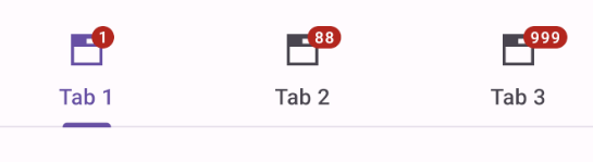
Adding fixed tabs
Fixed tabs display all tabs on one screen, with each tab at a fixed width. The width of each tab is determined by dividing the number of tabs by the screen width. They don’t scroll to reveal more tabs; the visible tab set represents the only tabs available.
Fixed tabs example
The following example shows a row of fixed tabs.
In the layout:
<com.google.android.material.tabs.TabLayout
    android:layout_width="match_parent"
    android:layout_height="wrap_content"
    app:tabMode="fixed">

    <com.google.android.material.tabs.TabItem
        android:layout_width="wrap_content"
        android:layout_height="wrap_content"
        android:text="@string/tab_1"
        android:icon="@drawable/ic_favorite_24dp"
        />

    <com.google.android.material.tabs.TabItem
        android:layout_width="wrap_content"
        android:layout_height="wrap_content"
        android:text="@string/tab_2"
        android:icon="@drawable/ic_music_24dp"
        />

    <com.google.android.material.tabs.TabItem
        android:layout_width="wrap_content"
        android:layout_height="wrap_content"
        android:text="@string/tab_3"
        android:icon="@drawable/ic_search_24dp"
        />

</com.google.android.material.tabs.TabLayout>
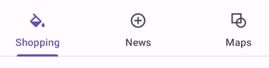
Adding scrollable tabs
Scrollable tabs are displayed without fixed widths. They are scrollable, such that some tabs will remain off-screen until scrolled.
Scrollable tabs example
The following example shows a row of scrollable tabs.
In the layout:
<com.google.android.material.tabs.TabLayout
    android:layout_width="match_parent"
    android:layout_height="wrap_content"
    app:tabMode="scrollable"
    app:tabContentStart="56dp">

    <com.google.android.material.tabs.TabItem
        android:layout_width="wrap_content"
        android:layout_height="wrap_content"
        android:text="@string/tab_1"
        />

    <com.google.android.material.tabs.TabItem
        android:layout_width="wrap_content"
        android:layout_height="wrap_content"
        android:text="@string/tab_2"
        />

    <com.google.android.material.tabs.TabItem
        android:layout_width="wrap_content"
        android:layout_height="wrap_content"
        android:text="@string/tab_3"
        />

    <com.google.android.material.tabs.TabItem
        android:layout_width="wrap_content"
        android:layout_height="wrap_content"
        android:text="@string/tab_4"
        />

    <com.google.android.material.tabs.TabItem
        android:layout_width="wrap_content"
        android:layout_height="wrap_content"
        android:text="@string/tab_5"
        />
    ...
</com.google.android.material.tabs.TabLayout>
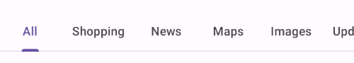
Customizing tabs
Theming tabs
Tabs support the customization of color and typography.
Tabs theming example
API and source code:
TabLayoutTabItem
The following example shows a row of scrollable tabs with Material theming.
Implementing tabs theming
Use theme attributes and styles in res/values/styles.xml which applies to all
tabs and affects other components:
<style name="Theme.App" parent="Theme.Material3.*">
    ...
    <item name="colorPrimary">@color/shrine_pink_900</item>
    <item name="colorSurface">@color/shrine_pink_light</item>
    <item name="colorOnSurface">@color/shrine_pink_900</item>
    <item name="textAppearanceLabelLarge">@style/TextAppearance.App.LabelLarge</item>
</style>

<style name="TextAppearance.App.LabelLarge" parent="TextAppearance.Material3.LabelLarge">
    <item name="fontFamily">@font/rubik</item>
    <item name="android:fontFamily">@font/rubik</item>
</style>
Use default style theme attributes, styles and theme overlays, which apply to all tabs but do not affect other components:
<style name="Theme.App" parent="Theme.Material3.*">
    ...
    <item name="tabStyle">@style/Widget.App.LabelLarge</item>
</style>

<style name="Widget.App.TabLayout" parent="Widget.Material3.TabLayout">
    <item name="materialThemeOverlay">@style/ThemeOverlay.App.TabLayout</item>
    <item name="tabTextAppearance">@style/TextAppearance.App.LabelLarge</item>
</style>

<style name="ThemeOverlay.App.TabLayout" parent="">
    <item name="colorPrimary">@color/shrine_pink_900</item>
    <item name="colorSurface">@color/shrine_pink_light</item>
    <item name="colorOnSurface">@color/shrine_pink_900</item>
</style>
Use the style in the layout, which affects only these tabs:
<com.google.android.material.tabs.TabLayout
    ...
    style="@style/Widget.App.TabLayout"
    />