material-components-android
Navigation rail
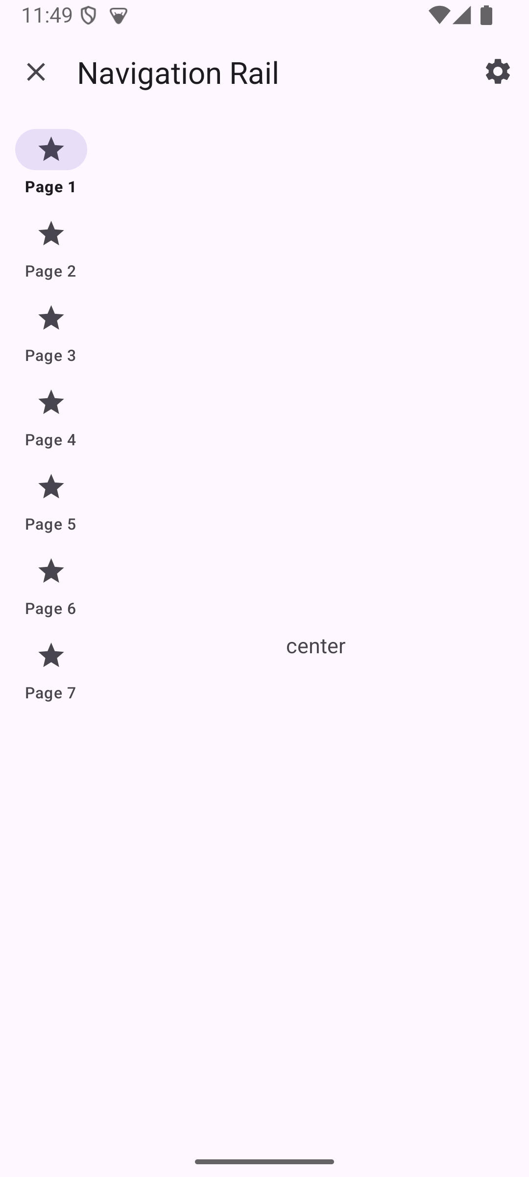
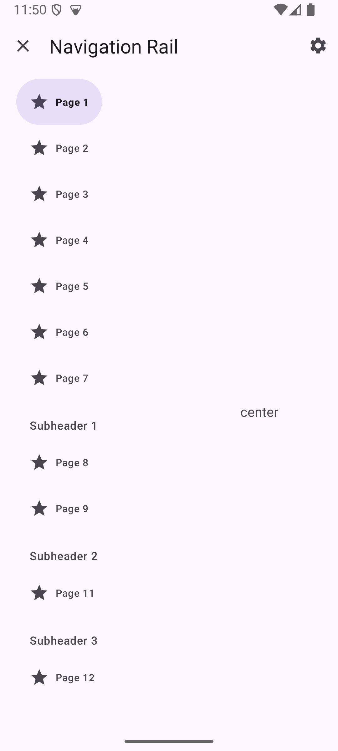
Navigation rail lets people switch between UI views on mid-sized devices. There are two types of navigation rail.
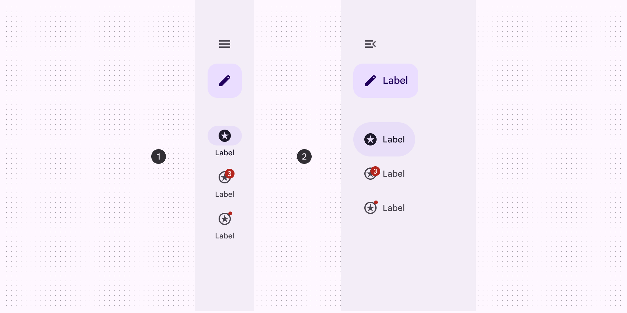
- Collapsed navigation rail
- Expanded navigation rail
Note: Images use various dynamic color schemes.
Design & API documentation
Anatomy
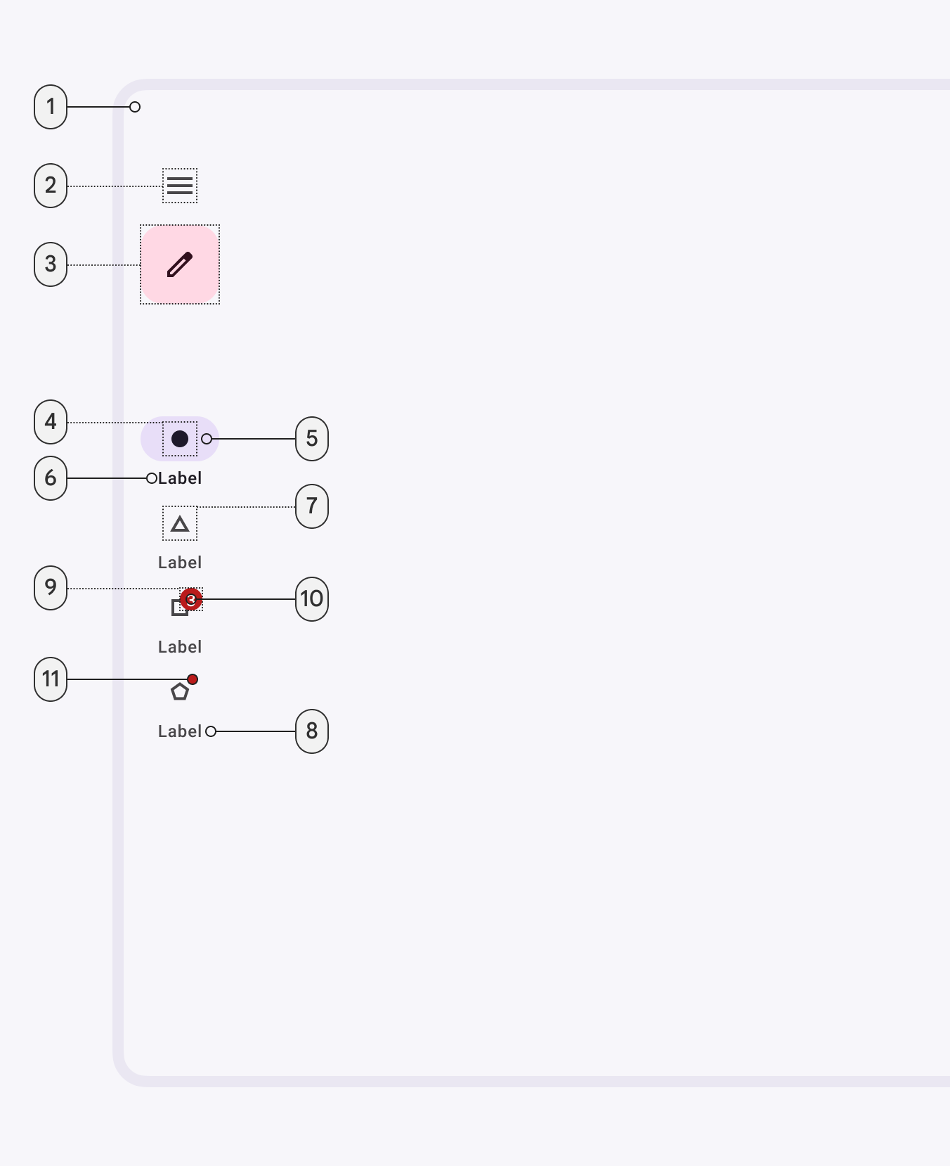 Collapsed and expanded navigation rail elements:
- Container
- Menu (optional)
- FAB or Extended FAB (optional)
- Icon
- Active indicator
- Label text
- Large badge (optional)
- Large badge label (optional)
- Small badge (optional)
More details on anatomy items in the component guidelines.
M3 Expressive
M3 Expressive update
Before you can use Material3Expressive component styles, follow the
Material3Expressive themes setup instructions.
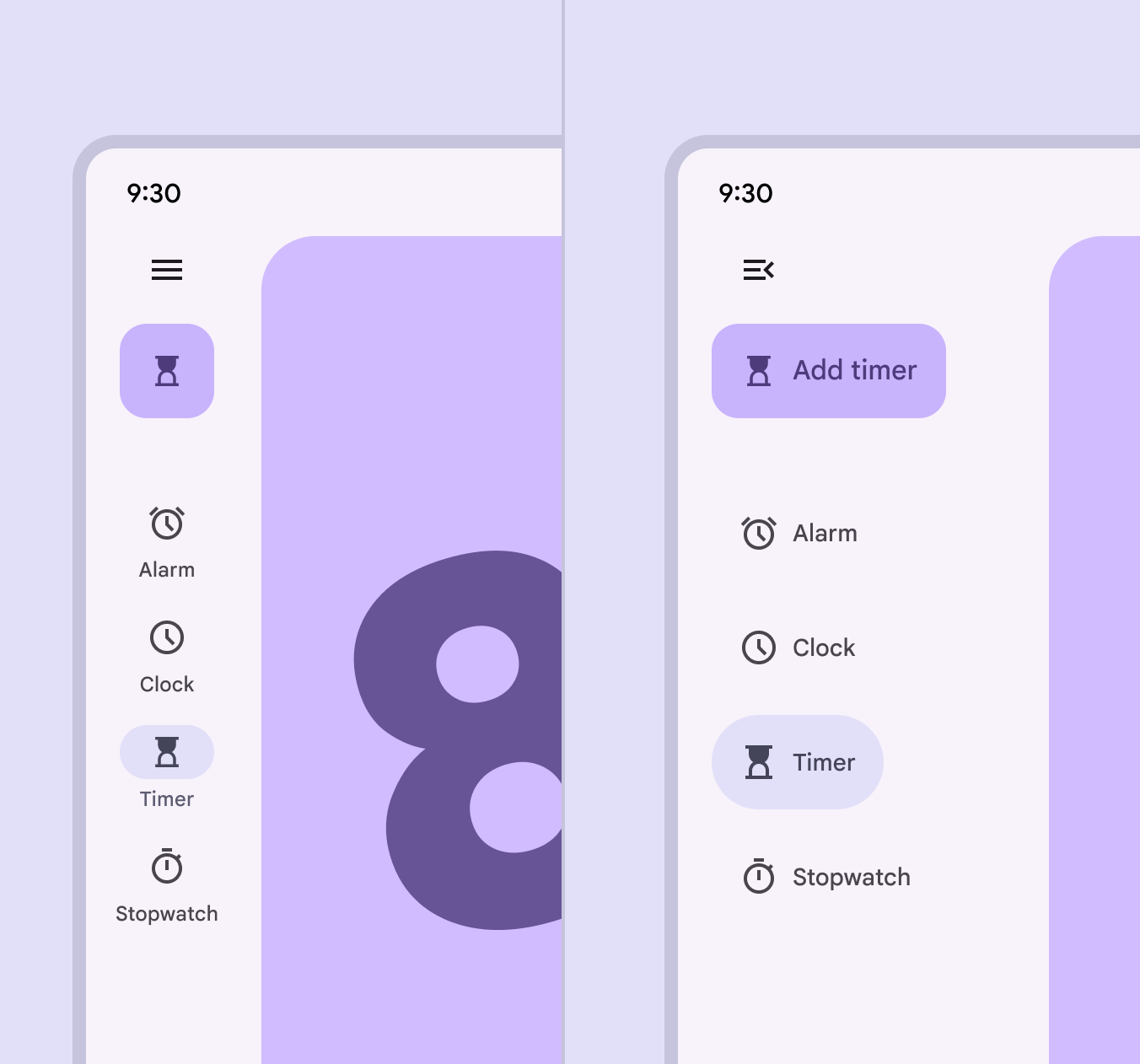 The collapsed and expanded navigation rails match visually and can transition
into each other
The collapsed and expanded navigation rails match visually and can transition
into each other
The navigation rail can now be expanded to show more content, functioning similarly to a navigation drawer. When not expanded, it is referred to as a collapsed navigation rail, which is its default state.
The expanded nav rail is meant to replace the navigation drawer. More on M3 Expressive
Types and naming:
- The original navigation rail is now known as collapsed navigation rail
- Added two wider navigation rails:
- Collapsed: Renamed original nav rail
- Expanded: replaces navigation drawer
Configurations:
- Expanded rail modality:
- Non-modal
- Expanded behavior:
- Transition to collapsed navigation rail
Color:
- Active label on vertical items changed from on surface variant to secondary
M3 Expressive styles
Measurement changes from M3:
- Width: from 80dp to 96dp
- Color: new expressive colors!
- Item minimum height: from 60dp to 64dp
- Item spacing: from 0dp to 4dp
- Elevation: from 0dp to 3dp
- Top item padding: from 4dp to 6dp
- Bottom item padding: from 12dp to 4dp
- Top margin of navigation rail content: from 8dp to 44dp
- Padding between optional header view and navigation rail items: from 8dp to 40dp
- Label text is no longer bolded when selected
The default style for navigation rail is:
<item name="navigationRailStyle">@style/Widget.Material3Expressive.NavigationRailView</item>
Key properties
Container attributes
| Element | Attribute | Related methods | Default value |
|---|---|---|---|
| Color | app:backgroundTint |
N/A | ?attr/colorSurface |
| Elevation | app:elevation |
setElevation |
0dp |
| Fits system windows | android:fitsSystemWindows |
getFitsSystemWindowssetFitsSystemWindows |
true |
| Padding top system window insets | app:paddingTopSystemWindowInsets |
N/A | null |
| Padding bottom system window insets | app:paddingBottomSystemWindowInsets |
N/A | null |
| Top margin | app:contentMarginTop |
N/A | N/A |
| Scrolling | app:scrollingEnabled |
N/A | false |
Header attributes
| Element | Attribute | Related methods | Default value |
|---|---|---|---|
| Header view | app:headerLayout |
addHeaderViewremoveHeaderViewgetHeaderView |
N/A |
| Header bottom margin | app:headerMarginBottom |
N/A | 8dp |
See the FAB documentation for more attributes.
Navigation Menu attributes
| Element | Attribute | Related methods | Default value |
|---|---|---|---|
| Menu gravity | app:menuGravity |
setMenuGravitygetMenuGravity |
TOP\|CENTER_HORIZONTAL |
| Dividers | app:submenuDividersEnabled |
setSubmenuDividersEnabledgetSubmenuDividersEnabled |
false |
Note: If dividers are enabled, they will be between all submenus, which are only visible when expanded.
Navigation item attributes
| Element | Attribute | Related methods | Default value |
|---|---|---|---|
| Menu resource | app:menu |
inflateMenugetMenu |
N/A |
| Ripple (inactive) | app:itemRippleColor |
setItemRippleColorgetItemRippleColor |
?attr/colorPrimary at 12% (see all states) |
| Ripple (active) | app:itemRippleColor |
setItemRippleColorgetItemRippleColor |
?attr/colorPrimary at 12% (see all states) |
| Label visibility mode | app:labelVisibilityMode |
setLabelVisibilityModegetLabelVisibilityMode |
LABEL_VISIBILITY_AUTO |
| Item minimum height | app:itemMinHeight |
setItemMinimumHeightgetItemMinimumHeight |
NO_ITEM_MINIMUM_HEIGHT |
| Collapsed item minimum height | app:collapsedItemMinHeight |
setCollapsedItemMinimumHeightgetCollapsedItemMinimumHeight |
NO_ITEM_MINIMUM_HEIGHT |
| Expanded item minimum height | app:expandedItemMinHeight |
setExpandedItemMinimumHeightgetExpandedItemMinimumHeight |
NO_ITEM_MINIMUM_HEIGHT |
| Item spacing | app:itemSpacing |
setItemSpacinggetItemSpacing |
0dp |
| Item Gravity | app:itemGravity |
setItemGravitygetItemGravity |
TOP_CENTER |
Note: If there’s not enough room, itemMinHeight and itemSpacing may not
be respected in order to fit the items.
Active indicator attributes
| Element | Attribute | Related methods | Default value |
|---|---|---|---|
| Color | android:color |
setItemActiveIndicatorColorgetItemActiveIndicatorColor |
?attr/colorSecondaryContainer |
| Width | android:width |
setItemActiveIndicatorWidthgetItemActiveIndicatorWidth |
56dp |
| Height | android:height |
setItemActiveIndicatorHeightgetItemActiveIndicatorHeight |
32dp |
| Shape | app:shapeAppearance |
setItemActiveIndicatorShapeAppearancegetItemActiveIndicatorShapeAppearance |
50% rounded |
| Margin horizontal | app:marginHorizontal |
setItemActiveIndicatorMarginHorizontalgetItemActiveIndicatorMarginHorizontal |
4dp |
| Padding between indicator and label | app:activeIndicatorLabelPadding |
setActiveIndicatorLabelPadding getActiveIndicatorLabelPadding |
4dp |
| Expanded Width | app:expandedWidth |
setItemActiveIndicatorExpandedWidthgetItemActiveIndicatorExpandedWidth |
HUG |
| Expanded Height | app:expandedHeight |
setItemActiveIndicatorExpandedHeightgetItemActiveIndicatorExpandedHeight |
56dp |
| Expanded Margin horizontal | app:expandedMarginHorizontal |
setItemActiveIndicatorExpandedMarginHorizontalgetItemActiveIndicatorExpandedMarginHorizontal |
20dp |
| Expanded Start Padding | app:expandedActiveIndicatorPaddingStart |
setItemExpandedActiveIndicatorPadding |
16dp |
| Expanded End Padding | app:expandedActiveIndicatorPaddingEnd |
setItemExpandedActiveIndicatorPadding |
16dp |
| Expanded Top Padding | app:expandedActiveIndicatorPaddingTop |
setItemExpandedActiveIndicatorPadding |
16dp |
| Expanded Bottom Padding | app:expandedActiveIndicatorPaddingBottom |
setItemExpandedActiveIndicatorPadding |
16dp |
Note: The expanded active indicator refers to the active indicator that
expands to wrap the content of the navigation rail item when the
itemIconGravity value is equal to START.
Icon attributes
| Element | Attribute | Related methods | Default value |
|---|---|---|---|
| Icon | android:icon in the menu resource |
N/A | N/A |
| Size | app:itemIconSize |
setItemIconSizesetItemIconSizeResgetItemIconSize |
24dp |
| Color (inactive) | app:itemIconTint |
setItemIconTintListgetItemIconTintList |
?attr/colorOnSurfaceVariant |
| Color (active) | app:itemIconTint |
setItemIconTintListgetItemIconTintList |
?attr/colorOnSecondaryContainer |
| Gravity | app:itemIconGravity |
setItemIconGravitygetItemIconGravity |
TOP |
| Icon label horizontal padding | app:iconLabelHorizontalSpacing |
setIconLabelHorizontalSpacinggetIconLabelHorizontalSpacing |
8dp |
Text label attributes
| Element | Attribute | Related methods | Default value |
|---|---|---|---|
| Text label | android:title in the menu resource |
N/A | N/A |
| Color (inactive) | app:itemTextColor |
setItemTextColorgetItemTextColor |
?attr/colorOnSurfaceVariant |
| Color (active) | app:itemTextColor |
setItemTextColorgetItemTextColor |
?attr/colorOnSurface |
| Typography (inactive) | app:itemTextAppearanceInactiveapp:horizontalItemTextAppearanceInactive |
setItemTextAppearanceInactivegetItemTextAppearanceInactivesetHorizontalItemTextAppearanceInactivegetHorizontalItemTextAppearanceInactive |
?attr/textAppearanceTitleSmall for regular item configuration, ?attr/textAppearanceLabelLarge for horizontal |
| Typography (active) | app:itemTextAppearanceActiveapp:horizontalItemTextAppearanceActive |
setItemTextAppearanceActivegetItemTextAppearanceActivesetHorizontalItemTextAppearanceActivegetHorizontalItemTextAppearanceActive |
?attr/textAppearanceTitleSmall for regular item configuration, ?attr/textAppearanceLabelLarge for horizontal |
| Typography (active) | app:itemTextAppearanceActiveBoldEnabled |
setItemTextAppearanceActiveBoldEnabled |
true |
| Max lines | app:labelMaxLines |
setLabelMaxLinesgetLabelMaxLines |
1 |
| Scale with font size | app:scaleLabelWithFontSize |
setScaleLabelTextWithFontgetScaleLabelTextWithFont |
false |
Styles
| Element | Style | Container color | Icon/Text label color (inactive) | Icon/Text label color (active) | Theme attribute |
|---|---|---|---|---|---|
| Default style | Widget.Material3.NavigationRailView |
?attr/colorSurface |
?attr/colorOnSurfaceVariant |
?attr/colorOnSurface?attr/colorOnSecondaryContainer |
?attr/navigationRailStyle |
For the full list, see styles, navigation bar attributes, and navigation rail attributes.
Code implementation
Before you can use the Material navigation rail, you need to add a dependency to the Material components for Android library. For more information, go to the Getting started page.
Adding navigation rail
A typical layout will look similar to this:
```xml
Navigation rail example
The following example shows a navigation rail with four icons.
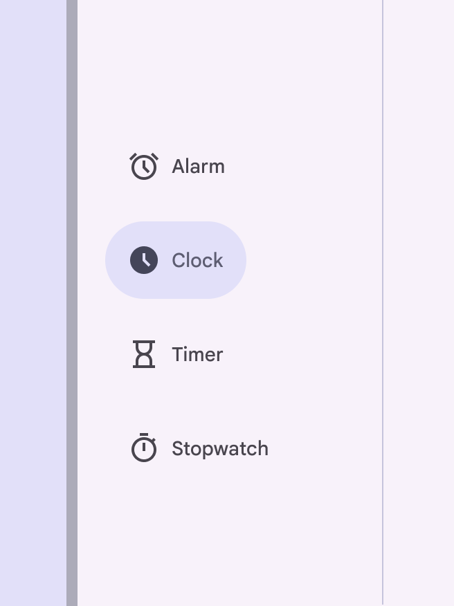 * Alarms
* Schedule
* Timers
* Stopwatch
In `navigation_rail_menu.xml` inside a `menu` resource directory:
```xml
```
In code:
```kt
navigationRail.selectedItemId = R.id.schedule
```
* Alarms
* Schedule
* Timers
* Stopwatch
In `navigation_rail_menu.xml` inside a `menu` resource directory:
```xml
```
In code:
```kt
navigationRail.selectedItemId = R.id.schedule
```
Making navigation rail accessible
You should set an `android:title` for each of your `menu` items so that screen
readers like TalkBack can properly announce what each navigation item
represents:
```xml
```
The `labelVisibilityMode` attribute can be used to adjust the behavior of the
text labels for each navigation item. There are four visibility modes:
* `LABEL_VISIBILITY_AUTO` (default): The label behaves as “labeled” when there
are 3 items or less, or “selected” when there are 4 items or more
* `LABEL_VISIBILITY_SELECTED`: The label is only shown on the selected
navigation item
* `LABEL_VISIBILITY_LABELED`: The label is shown on all navigation items
* `LABEL_VISIBILITY_UNLABELED`: The label is hidden for all navigation items
Expanding navigation rail
You can call `navigationRailView.expand()` and `navigationRailView.collapse()`
to expand and collapse the navigation rail. When collapsed, only menu items not
under a submenu will be shown, up to a limit of 7. When expanded, all menu items
will be shown, including submenu items.
Navigation rails are collapsed by default which animates into the expanded
navigation rail when expanded. If the content beside the navigation rail takes
into account the size of the navigation rail (ie., through setting constraints
in `ConstraintLayout` or layout weights) then the content will also be animated
to shrink. This animation is taken care of by a
[ChangeBounds Transition](https://developer.android.com/reference/android/transition/ChangeBounds);
any animations during the expansion of the navigation rail should be 'turned
off' as it could result in a strange animation due to the `Transition`.
Collapsed navigation rail | Expanded navigation rail
:----------------------------------------------------------------------------------------------------: | :------------------------------------------------------:
 |
| 
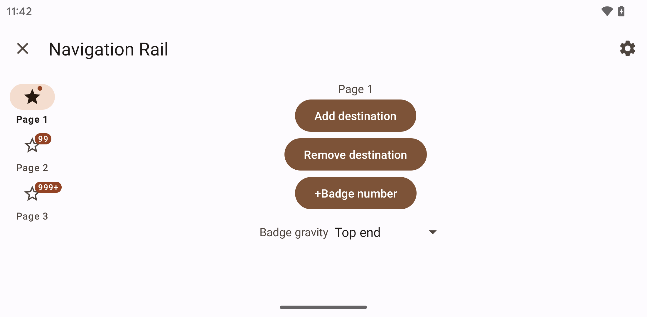
Adding badges
Rail icons can include badges on the upper right corner of the icon. Badges
convey dynamic information about the associated destination, such as counts or
status.
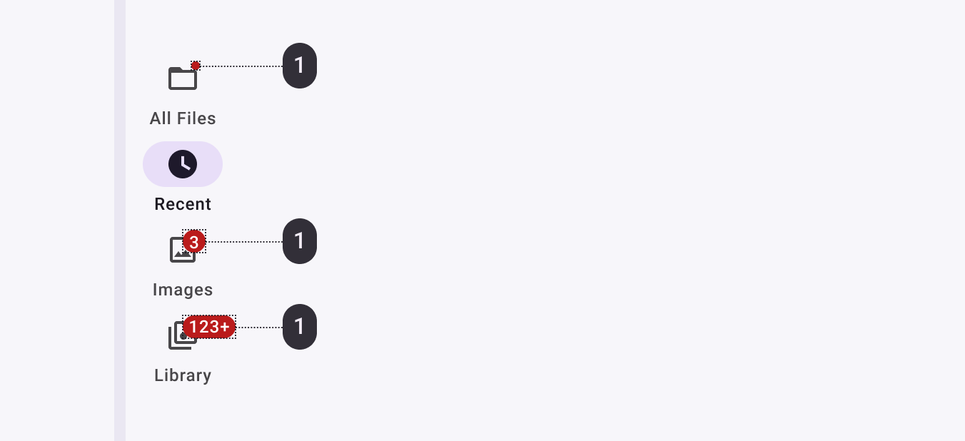
Initialize and show a `BadgeDrawable` associated with `menuItemId`. Subsequent
calls to this method will reuse the existing `BadgeDrawable`:
```kt
var badge = navigationRail.getOrCreateBadge(menuItemId)
badge.isVisible = true
// An icon only badge will be displayed unless a number or text is set:
badge.number = 99 // or badge.text = "New"
```
As best practice, if you need to temporarily hide the badge, for example until
the next notification is received, change the visibility of `BadgeDrawable`:
```kt
val badgeDrawable = navigationRail.getBadge(menuItemId)
if (badgeDrawable != null) {
badgeDrawable.isVisible = false
badgeDrawable.clearNumber() // or badgeDrawable.clearText()
}
```
To remove any `BadgeDrawable`s that are no longer needed:
```kt
navigationRail.removeBadge(menuItemId)
```
See the [`Badge`](/material-components-android/components/BadgeDrawable.html) documentation for more information.
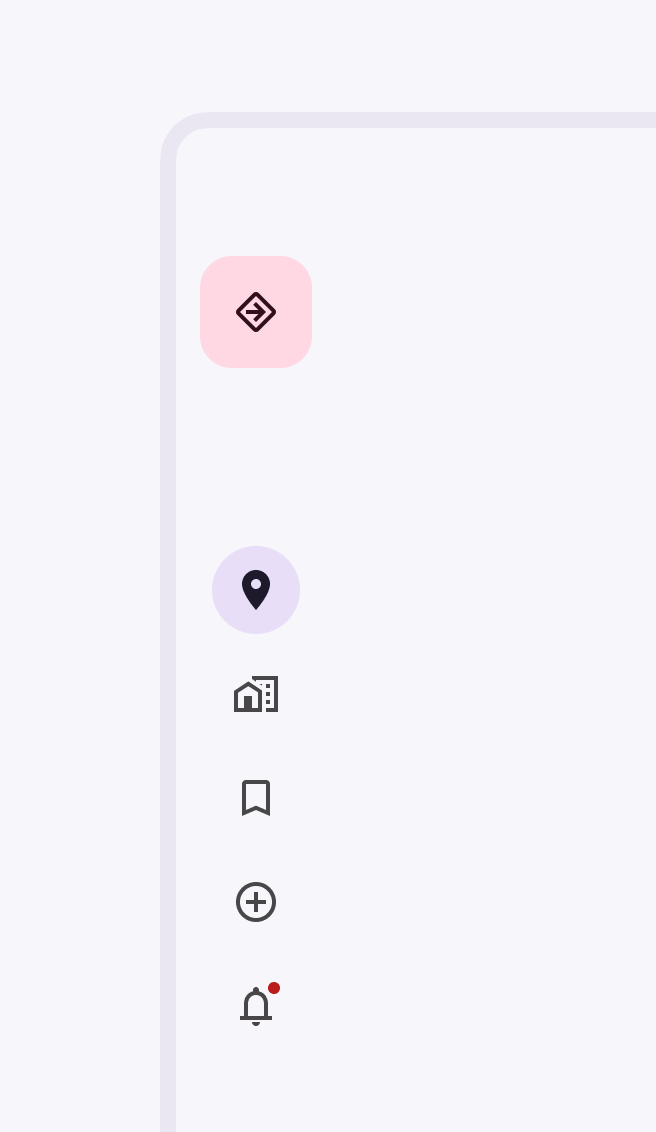
Adding header view
The rail provides a convenient container for anchoring a header view, such as a
`FloatingActionButton` or a logo, to the top of the rail, using the
`app:headerLayout` attribute.
 ```xml
Customizing navigation rail
Theming navigation rail
Navigation rail supports the customization of color and typography.
Navigation rail theming example
API and source code:
NavigationRailView
The following example shows a navigation rail with Material theming.
Implementing navigation rail theming
Use theme attributes and a style in res/values/styles.xml which apply to all
navigation rails and affect other components:
<style name="Theme.App" parent="Theme.Material3.*">
    ...
    <item name="colorPrimary">@color/shrine_theme_light_primary</item>
    <item name="colorSecondaryContainer">@color/shrine_theme_light_secondaryContainer</item>
    <item name="colorOnSecondaryContainer">@color/shrine_theme_light_onSecondaryContainer</item>
    <item name="colorTertiaryContainer">@color/shrine_theme_light_tertiaryContainer</item>
    <item name="colorOnTertiaryContainer">@color/shrine_theme_light_onTertiaryContainer</item>
    <item name="colorError">@color/shrine_theme_light_error</item>
    <item name="colorErrorContainer">@color/shrine_theme_light_errorContainer</item>
    <item name="colorOnError">@color/shrine_theme_light_onError</item>
    <item name="colorOnErrorContainer">@color/shrine_theme_light_onErrorContainer</item>
    <item name="colorSurface">@color/shrine_theme_light_surface</item>
    <item name="colorOnSurface">@color/shrine_theme_light_onSurface</item>
    <item name="colorOnSurfaceVariant">@color/shrine_theme_light_onSurfaceVariant</item>
</style>
Use a default style theme attribute, styles, and a theme overlay, which apply to all navigation rails but do not affect other components:
<style name="Theme.App" parent="Theme.Material3.*">
    ...
    <item name="navigationRailStyle">@style/Widget.App.NavigationRailView</item>
</style>

<style name="Widget.App.NavigationRailView" parent="Widget.Material3.NavigationRailView">
    <item name="materialThemeOverlay">@style/ThemeOverlay.App.NavigationRailView</item>
</style>

<style name="ThemeOverlay.App.NavigationRailView" parent="">
    <item name="colorPrimary">@color/shrine_theme_light_primary</item>
    <item name="colorSecondaryContainer">@color/shrine_theme_light_secondaryContainer</item>
    <item name="colorOnSecondaryContainer">@color/shrine_theme_light_onSecondaryContainer</item>
    <item name="colorTertiaryContainer">@color/shrine_theme_light_tertiaryContainer</item>
    <item name="colorOnTertiaryContainer">@color/shrine_theme_light_onTertiaryContainer</item>
    <item name="colorError">@color/shrine_theme_light_error</item>
    <item name="colorErrorContainer">@color/shrine_theme_light_errorContainer</item>
    <item name="colorOnError">@color/shrine_theme_light_onError</item>
    <item name="colorOnErrorContainer">@color/shrine_theme_light_onErrorContainer</item>
    <item name="colorSurface">@color/shrine_theme_light_surface</item>
    <item name="colorOnSurface">@color/shrine_theme_light_onSurface</item>
    <item name="colorOnSurfaceVariant">@color/shrine_theme_light_onSurfaceVariant</item>
</style>
Or use the style in the layout, which affects only this specific navigation rail bar:
<com.google.android.material.navigationrail.NavigationRailView
    ...
    style="@style/Widget.App.NavigationRailView"
/>