material-components-android
Top app bars (App bars)
App bars are placed at the top of the screen to help people navigate through a product. There are four variants of app bars.
Note: The top app bar component is renamed to app bar in the design language.
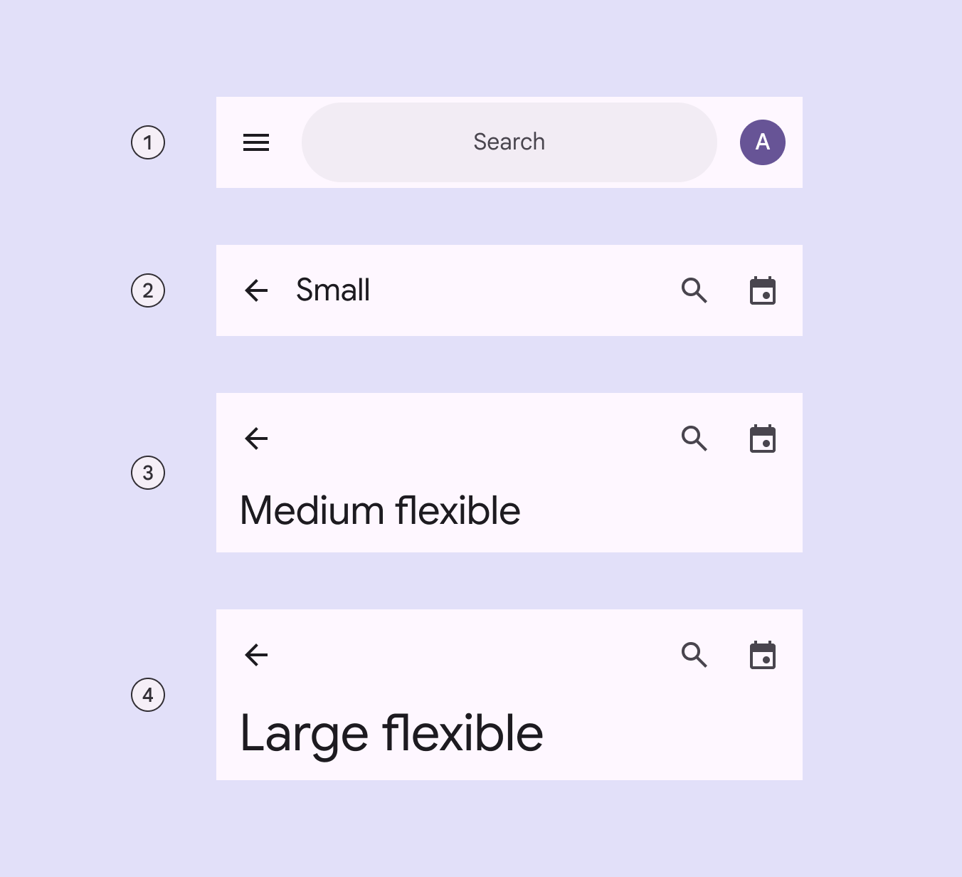
- Search app bar
- Small
- Medium flexible
- Large flexible
For implementation purposes, the search and small app bars can be grouped into regular top app bars, while the medium flexible and large flexible app bars can be grouped into collapsing top app bars.
An app bar can transform into a contextual action bar, remaining active until an action is taken or it is dismissed. For more information, see contextual action bar.
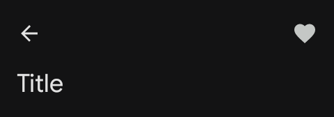
Note: Images use various dynamic color schemes.
There are two variants that are being deprecated and are no longer recommended:
- Medium - Replace with medium flexible.
- Large - Replace with large flexible.
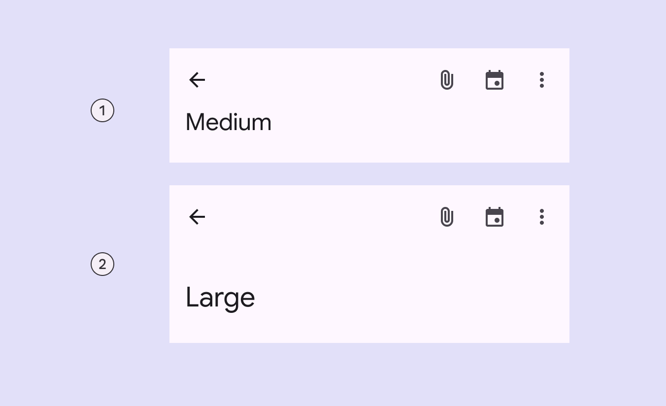
- Medium
- Large
Design & API documentation
Anatomy
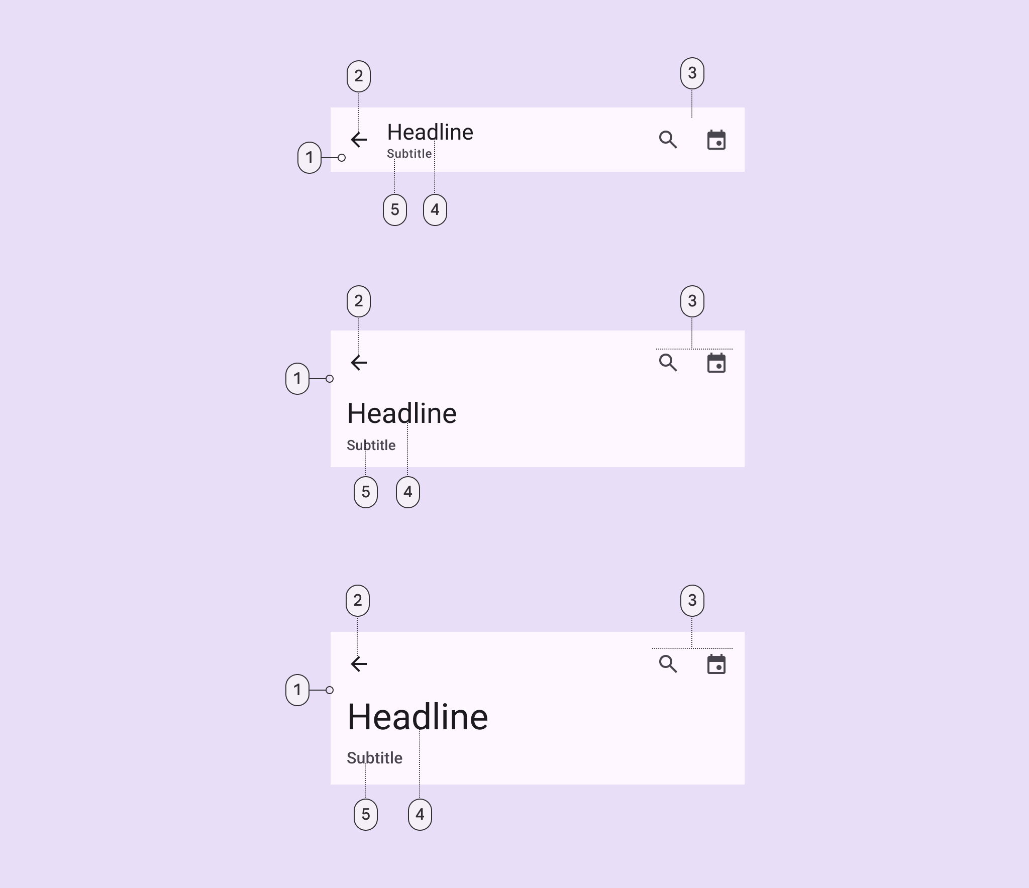
- Container
- Leading button
- Trailing elements
- Headline
- Subtitle
More details on anatomy items in the component guidelines.
M3 Expressive
M3 Expressive update
Before you can use Material3Expressive component styles, follow the
Material3Expressive themes setup instructions.
The new search app bar supports icons inside and outside the search bar, and centered text. It opens the search view component when selected.
The new medium flexible and large flexible app bars come with significant improvements, and should replace medium and large app bars, which are being deprecated. The small app bar is updated with the same flexible improvements. More on M3 Expressive
Types and naming:
- Renamed component from top app bar to app bar
- Added search app bar
- Deprecating medium and large app bars
- Added medium flexible and large flexible app bars with:
- Reduced overall height
- Larger title text
- Subtitle
- Left- and center-aligned text options
- Text wrapping
- More flexible elements for imagery and filled buttons
- Added features to small app bar:
- Subtitle
- Center-aligned text option
- More flexible elements for imagery and filled buttons
Key properties
Container attributes
| Element | Attribute | Related method(s) | Default value |
|---|---|---|---|
| Color | android:background |
setBackgroundgetBackground |
?attr/colorSurface |
MaterialToolbar elevation |
android:elevation |
setElevationgetElevation |
4dp |
AppBarLayout elevation |
android:stateListAnimator |
setStateListAnimatorgetStateListAnimator |
0dp to 4dp (see all states) |
Navigation icon attributes
| Element | Attribute | Related method(s) | Default value |
|---|---|---|---|
MaterialToolbar icon |
app:navigationIcon |
setNavigationIcongetNavigationIcon |
null |
MaterialToolbar icon color |
app:navigationIconTint |
setNavigationIconTint |
?attr/colorOnSurface |
Title attributes
| Element | Attribute | Related method(s) | Default value |
|---|---|---|---|
MaterialToolbar title text |
app:title |
setTitlegetTitle |
null |
MaterialToolbar subtitle text |
app:subtitle |
setSubtitlegetSubtitle |
null |
MaterialToolbar title color |
app:titleTextColor |
setTitleTextColor |
?attr/colorOnSurface |
MaterialToolbar subtitle color |
app:subtitleTextColor |
setSubtitleTextColor |
?attr/colorOnSurfaceVariant |
MaterialToolbar title typography |
app:titleTextAppearance |
setTitleTextAppearance |
?attr/textAppearanceTitleLarge |
MaterialToolbar subtitle typography |
app:subtitleTextAppearance |
setSubtitleTextAppearance |
?attr/textAppearanceTitleMedium |
MaterialToolbar title centering |
app:titleCentered |
setTitleCentered |
false |
MaterialToolbar subtitle centering |
app:subtitleCentered |
setSubtitleCentered |
false |
CollapsingToolbarLayout collapsed title typography |
app:collapsedTitleTextAppearance |
setCollapsedTitleTextAppearance |
?attr/textAppearanceTitleLarge |
CollapsingToolbarLayout expanded title typography |
app:expandedTitleTextAppearance |
setExpandedTitleTextAppearance |
?attr/textAppearanceHeadlineSmall for Medium</br>?attr/textAppearanceHeadlineMedium for Large |
CollapsingToolbarLayout collapsed title color |
android:textColor (in app:collapsedTitleTextAppearance) or app:collapsedTitleTextColor |
setCollapsedTitleTextColor |
?attr/colorOnSurface |
CollapsingToolbarLayout expanded title color |
android:textColor (in app:expandedTitleTextAppearance) or app:expandedTitleTextColor |
setExpandedTitleTextColor |
?attr/colorOnSurface |
CollapsingToolbarLayout collapsed subtitle typography |
app:collapsedSubtitleTextAppearance |
setCollapsedSubtitleTextAppearance |
?attr/textAppearanceTitleMedium |
CollapsingToolbarLayout expanded subtitle typography |
app:expandedSubtitleTextAppearance |
setExpandedSubtitleTextAppearance |
?attr/textAppearanceTitleLarge for Medium</br>?attr/textAppearanceHeadlineSmall for Large |
CollapsingToolbarLayout collapsed subtitle color |
android:textColor (in app:collapsedSubtitleTextAppearance) or app:collapsedSubtitleTextColor |
setCollapsedSubtitleTextColor |
?attr/colorOnSurface |
CollapsingToolbarLayout expanded subtitle color |
android:textColor (in app:expandedSubtitleTextAppearance) or app:expandedSubtitleTextColor |
setExpandedSubtitleTextColor |
?attr/colorOnSurface |
CollapsingToolbarLayout expanded title margins |
app:expandedTitleMargin* |
setExpandedTitleMargin* |
16dp |
CollapsingToolbarLayout padding between expanded title and subtitle |
app:expandedTitlePadding |
setExpandedTitlePadding |
0dp |
CollapsingToolbarLayout title max lines |
app:maxLines |
setMaxLinesgetMaxLines |
1 |
CollapsingToolbarLayout title ellipsize |
app:titleTextEllipsize |
setTitleEllipsizegetTitleEllipsize |
end |
CollapsingToolbarLayout collapsed title gravity |
app:collapsedTitleGravity |
setCollapsedTitleGravitygetCollapsedTitleGravity |
start\|center_vertical |
CollapsingToolbarLayout collapsed title gravity mode |
app:collapsedTitleGravityMode |
– | availableSpace |
CollapsingToolbarLayout expanded title gravity |
app:expandedTitleGravity |
setExpandedTitleGravitygetExpandedTitleGravity |
start\|bottom |
Action items attributes
| Element | Attribute | Related method(s) | Default value |
|---|---|---|---|
MaterialToolbar menu |
app:menu |
inflateMenugetMenu |
null |
MaterialToolbar icon color |
N/A | N/A | ?attr/colorOnSurfaceVariant |
Overflow menu attributes
| Element | Attribute | Related method(s) | Default value |
|---|---|---|---|
MaterialToolbar icon |
android:src and app:srcCompat in actionOverflowButtonStyle (in app theme) |
setOverflowIcongetOverflowIcon |
@drawable/abc_ic_menu_overflow_material (before API 23) or @drawable/ic_menu_moreoverflow_material (after API 23) |
MaterialToolbar overflow theme |
app:popupTheme |
setPopupThemegetPopupTheme |
@style/ThemeOverlay.Material3.* |
MaterialToolbar overflow item typography |
textAppearanceSmallPopupMenu and textAppearanceLargePopupMenu in app:popupTheme or app theme |
N/A | ?attr/textAppearanceBodyLarge |
Scrolling behavior attributes
| Element | Attribute | Related method(s) | Default value |
|---|---|---|---|
MaterialToolbar or CollapsingToolbarLayout scroll flags |
app:layout_scrollFlags |
setScrollFlagsgetScrollFlags(on AppBarLayout.LayoutParams) |
noScroll |
MaterialToolbar collapse mode |
app:collapseMode |
setCollapseModegetCollapseMode(on CollapsingToolbar) |
none |
CollapsingToolbarLayout content scrim color |
app:contentScrim |
setContentScrimsetContentScrimColorsetContentScrimResourcegetContentScrim |
null |
CollapsingToolbarLayout status bar scrim color |
app:statusBarScrim |
setStatusBarScrimsetStatusBarScrimColorsetStatusBarScrimResourcegetStatusBarScrim |
@empty |
CollapsingToolbarLayout scrim animation duration |
app:scrimAnimationDuration |
setScrimAnimationDurationgetScrimAnimationDuration |
600 |
CollapsingToolbarLayout collapsing animation interpolator |
app:titlePositionInterpolator |
setTitlePositionInterpolator |
@null |
AppBarLayout lift on scroll |
app:liftOnScroll |
setLiftOnScrollisLiftOnScroll |
true |
AppBarLayout lift on scroll color |
app:liftOnScrollColor |
N/A | ?attr/colorSurfaceContainer |
AppBarLayout lift on scroll target view |
app:liftOnScrollTargetViewId |
setLiftOnScrollTargetViewIdgetLiftOnScrollTargetViewId |
@null |
AppBarLayout scroll effect |
app:layout_scrollEffect |
setScrollEffectgetScrollEffect |
none |
AppBarLayout styles
- | Element | Style | Theme attribute |
- | ————- | ——————————- | ————————- |
- | **Surface |
Widget.Material3.AppBarLayout|?attr/appBarLayoutStyle| - background : : :
- color style** : : :
MaterialToolbar styles
| Element | Style | Theme attribute |
|---|---|---|
| Default style | Widget.Material3.Toolbar |
?attr/toolbarStyle |
| Surface background color style | Widget.Material3.Toolbar.Surface |
?attr/toolbarSurfaceStyle |
| On Surface color style | Widget.Material3.Toolbar.OnSurface |
N/A |
CollapsingToolbarLayout styles
| Element | Style | Theme attribute |
|---|---|---|
| Default style | Widget.Material3.CollapsingToolbar |
?attr/collapsingToolbarLayoutStyle |
| Medium style | Widget.Material3.CollapsingToolbar.Medium |
?attr/collapsingToolbarLayoutMediumStyle |
| Large style | Widget.Material3.CollapsingToolbar.Large |
?attr/collapsingToolbarLayoutLargeStyle |
For the full list, see styles and attrs.
Variants of app bars
Search app bar
Use a search app bar to provide an emphasized entry-point to open the search
view. Use it on home pages when search is key to the product.
 Search app bars have a search field instead of heading text
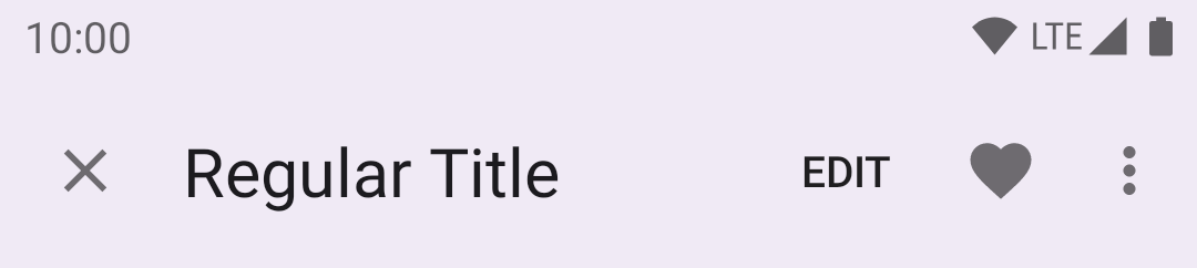
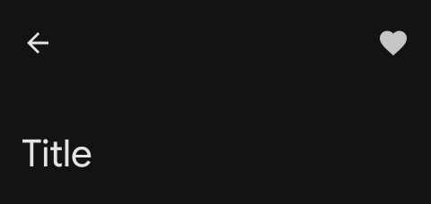
Small app bar
Use in dense layouts or when a page is scrolled.
The following example shows a small top app bar with a page title, a navigation
icon, two actions, and an overflow menu.
 In the layout:
```xml
<androidx.coordinatorlayout.widget.CoordinatorLayout
...
android:layout_width="match_parent"
android:layout_height="match_parent">
In the layout:
```xml
<androidx.coordinatorlayout.widget.CoordinatorLayout
...
android:layout_width="match_parent"
android:layout_height="match_parent">
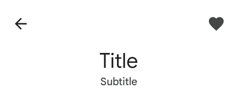
Medium flexible app bar
Use to display a larger headline. It can collapse into a small app bar on
scroll.
 The
[medium flexible top app bar](https://m3.material.io/components/app-bars/specs#51ac0fae-61c2-4abc-b8f9-1167bf54e875)
introduced in expressive updates includes flexible heights, multi-line support,
and can contain a wider variety of elements. These features are already
supported/configurable within the existing Medium variant. Therefore, the name
of the existing `medium` variant will be reused in the `Material3Expressive`
theme.
**If you are using a `Material3Expressive` theme:**
The existing `?attr/collapsingToolbarLayoutMediumStyle` attribute has been
updated to the new flexible behavior. You do not need to change your XML layouts
to get the new functionality.
**If you are not using a `Material3Expressive` theme:**
You should migrate to one of the expressive themes to use the new flexible app
bar styles.
To properly draw the subtitle in expanded mode. Please use the following:
```xml
The
[medium flexible top app bar](https://m3.material.io/components/app-bars/specs#51ac0fae-61c2-4abc-b8f9-1167bf54e875)
introduced in expressive updates includes flexible heights, multi-line support,
and can contain a wider variety of elements. These features are already
supported/configurable within the existing Medium variant. Therefore, the name
of the existing `medium` variant will be reused in the `Material3Expressive`
theme.
**If you are using a `Material3Expressive` theme:**
The existing `?attr/collapsingToolbarLayoutMediumStyle` attribute has been
updated to the new flexible behavior. You do not need to change your XML layouts
to get the new functionality.
**If you are not using a `Material3Expressive` theme:**
You should migrate to one of the expressive themes to use the new flexible app
bar styles.
To properly draw the subtitle in expanded mode. Please use the following:
```xml
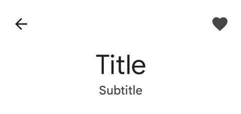
Large flexible app bar
Use to emphasize the headline of the page.
 The
[large flexible top app bar](https://m3.material.io/components/app-bars/specs#51ac0fae-61c2-4abc-b8f9-1167bf54e875)
introduced in expressive updates includes flexible heights, multi-line support,
and can contain a wider variety of elements. These features are already
supported/configurable within the existing Large variant. Therefore, the name of
the existing `large` variant will be reused in the `Material3Expressive` theme.
**If you are using a `Material3Expressive` theme:**
The existing `?attr/collapsingToolbarLayoutLargeStyle` attribute has been
updated to the new flexible behavior. You do not need to change your XML layouts
to get the new functionality.
**If you are not using a `Material3Expressive` theme:**
You should migrate to one of the expressive themes to use the new flexible app
bar styles.
To properly draw the subtitle in expanded mode. Please use the following:
```xml
The
[large flexible top app bar](https://m3.material.io/components/app-bars/specs#51ac0fae-61c2-4abc-b8f9-1167bf54e875)
introduced in expressive updates includes flexible heights, multi-line support,
and can contain a wider variety of elements. These features are already
supported/configurable within the existing Large variant. Therefore, the name of
the existing `large` variant will be reused in the `Material3Expressive` theme.
**If you are using a `Material3Expressive` theme:**
The existing `?attr/collapsingToolbarLayoutLargeStyle` attribute has been
updated to the new flexible behavior. You do not need to change your XML layouts
to get the new functionality.
**If you are not using a `Material3Expressive` theme:**
You should migrate to one of the expressive themes to use the new flexible app
bar styles.
To properly draw the subtitle in expanded mode. Please use the following:
```xml
Code implementation
Before you can use Material top app bars, you need to add a dependency to the Material components for Android library. For more information, go to the Getting started page.
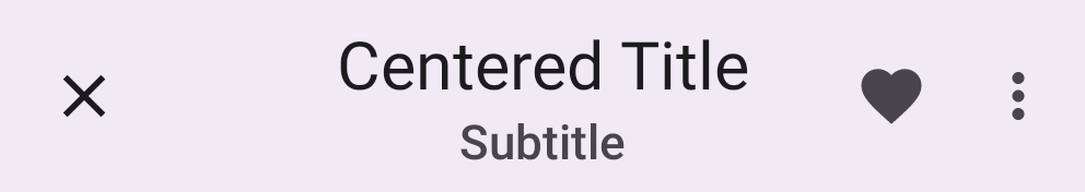
Center aligning app bars
The guidance and code for the all the app bars are also applicable for center
aligning the title in the app bars. To center align them, you only need to set
the `app:titleCentered` and/or `app:subtitleCentered` attributes to `true` on
your `MaterialToolbar`.
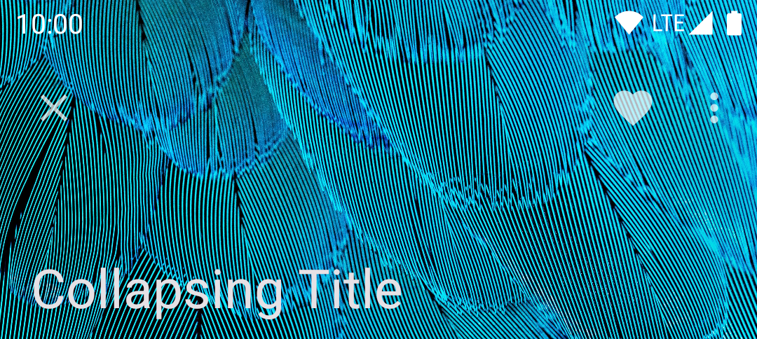
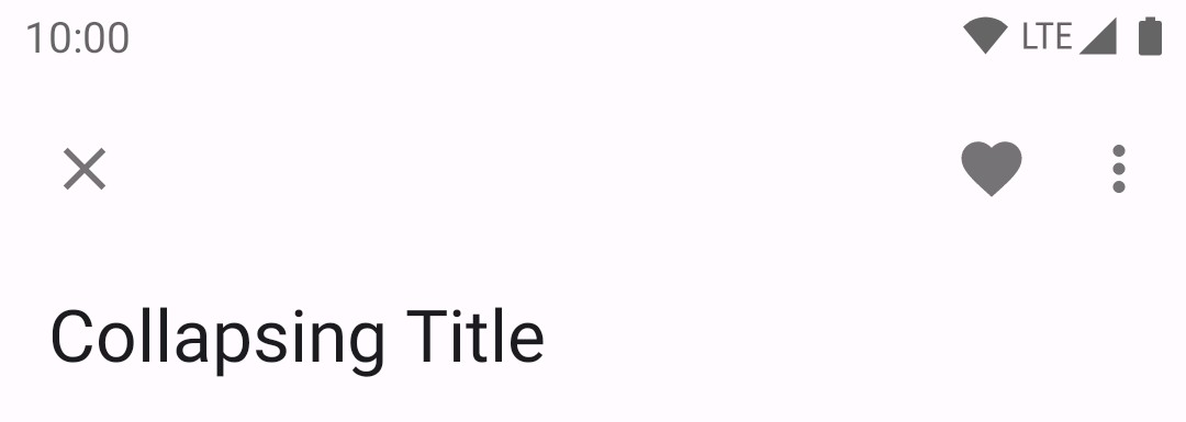
Adding image to collapsing app bars
A collapsing top app bar with an image background, a page title, a navigation
icon, two action icons, and an overflow menu:
 In the layout:
```xml
<androidx.coordinatorlayout.widget.CoordinatorLayout
...
android:fitsSystemWindows="true">
<com.google.android.material.appbar.AppBarLayout
...
android:layout_width="match_parent"
android:layout_height="wrap_content"
android:fitsSystemWindows="true">
In the layout:
```xml
<androidx.coordinatorlayout.widget.CoordinatorLayout
...
android:fitsSystemWindows="true">
<com.google.android.material.appbar.AppBarLayout
...
android:layout_width="match_parent"
android:layout_height="wrap_content"
android:fitsSystemWindows="true">
Adding filled trailing icon button to app bars

With Expressive updates, a
[filled trailing icon button](https://m3.material.io/components/app-bars/specs#90d1e764-47e7-4e5d-9668-c00bc9599236)
can replace the default action items. To achieve this, please use the follow
layout configuration.
```xml
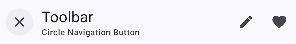
Adding a circle to the navigation button
If you would like to add a circle background to the navigation icon, set the
`android:theme="@style/ThemeOverlay.Material3.Toolbar.CircleNavigationButton"`
theme overlay on your `Toolbar` or `MaterialToolbar`.
By default, the theme overlay above uses `?attr/colorSurfaceContainer` for the
circle color. This can be customized by extending the theme overlay and setting
the `toolbarNavigationButtonCircleColor` attribute.
Applying scrolling behavior to app bars
When scrolling up, the collapsing top app bar transforms into a regular top app
bar.
The following example shows the top app bar positioned at the same elevation as
content. Upon scroll, it increases elevation and lets content scroll behind it.
In the layout:
```xml
<androidx.coordinatorlayout.widget.CoordinatorLayout
...>
<com.google.android.material.appbar.AppBarLayout
...
app:liftOnScroll="true">
<com.google.android.material.appbar.MaterialToolbar
...
/>
</com.google.android.material.appbar.AppBarLayout>
...
</androidx.coordinatorlayout.widget.CoordinatorLayout>
```
**Note:** If your scrolling view (`RecyclerView`, `ListView`, etc.) is nested
within another view (e.g., a `SwipeRefreshLayout`), you should make sure to set
`app:liftOnScrollTargetViewId` on your `AppBarLayout` to the id of the scrolling
view. This will ensure that the `AppBarLayout` is using the right view to
determine whether it should lift or not, and it will help avoid flicker issues.
The following example shows the top app bar disappearing upon scrolling up, and
appearing upon scrolling down.
In the layout:
```xml
<androidx.coordinatorlayout.widget.CoordinatorLayout
...>
<com.google.android.material.appbar.AppBarLayout
...>
<com.google.android.material.appbar.MaterialToolbar
...
app:layout_scrollFlags="scroll|enterAlways|snap"
/>
</com.google.android.material.appbar.AppBarLayout>
...
</androidx.coordinatorlayout.widget.CoordinatorLayout>
```
Optionally, you can change the style in which the app bar disappears and appears
when scrolling by setting a scroll effect. By default, a scroll effect of `none`
is set which translates the app bar in-step with the scrolling content. The
following option shows setting the `compress` scroll effect which clips the top
app bar until it meets the top of the screen:
In the layout:
```xml
<androidx.coordinatorlayout.widget.CoordinatorLayout
...>
<com.google.android.material.appbar.AppBarLayout
...>
<com.google.android.material.appbar.MaterialToolbar
...
app:layout_scrollFlags="scroll|enterAlways|snap"
app:layout_scrollEffect="compress"
/>
</com.google.android.material.appbar.AppBarLayout>
...
</androidx.coordinatorlayout.widget.CoordinatorLayout>
```
Making app bars accessible
Android's top app bar component APIs provide support for the navigation icon,
action items, overflow menu and more, to inform the user what each action
performs. While optional, their use is strongly encouraged.
#### Content descriptions
When using icons for navigation, action items and other elements of top app
bars, you should set a content description for them so that screen readers like
TalkBack are able to announce their purpose or action.
For an overall content description of the top app bar, set an
`android:contentDescription` or use the `setContentDescription` method on the
`MaterialToolbar`.
For the navigation icon, this can be achieved via the
`app:navigationContentDescription` attribute or
`setNavigationContentDescription` method.
For action items and items within the overflow menu, the content description
needs to be set in the menu:
```xml
<menu ...>
...
<item
...
android:contentDescription="@string/content_description_one" />
<item
...
android:contentDescription="@string/content_description_two" />
</menu>
```
For images within collapsing top app bars, set an `android:contentDescription`
or use the `setContentDescription` method for the `ImageView`.
Status bar and edge-to-edge
A common configuration for modern top app bars, as seen above, is to have a
seamless color shared with the status bar. The best way to achieve this is to
follow the
[edge-to-edge guidance](https://developer.android.com/training/gestures/edge-to-edge),
which will result in a transparent status bar that lets the background color of
the top app bar show through.
Make sure to set `android:fitsSystemWindows="true"` on your `AppBarLayout` (or
`MaterialToolbar` if not using `AppBarLayout`), so that an extra inset is added
to avoid overlap with the status bar.
If your `AppBarLayout` scrolls and content is visible under the status bar, you
can set the `AppBarLayout`'s `statusBarForeground` to a `MaterialShapeDrawable`
to let `AppBarLayout` automatically match the status bar color to its own
background.
In code:
```kt
appBarLayout.statusBarForeground =
MaterialShapeDrawable.createWithElevationOverlay(context)
```
Or if using tonal surface colors instead of elevation overlays, you can simply
set the `statusBarForeground` to `colorSurface` to let `AppBarLayout`
automatically match the status bar color to its own background:
```kt
appBarLayout.setStatusBarForegroundColor(
MaterialColors.getColor(appBarLayout, R.attr.colorSurface))
```
Customizing app bars
Theming app bars
App bars support the customization of color, typography, and shape.
App bar theming example
API and source code:
CoordinatorLayoutAppBarLayoutMaterialToolbarCollapsingToolbarLayout
A regular top app bar with Material theming:
Implementing app bar theming
Use theme attributes in res/values/styles.xml, which applies to all top app
bars and affects other components:
<style name="Theme.App" parent="Theme.Material3.*.NoActionBar">
    ...
    <item name="colorSurface">@color/shrine_pink_100</item>
    <item name="colorOnSurface">@color/shrine_pink_900</item>
    <item name="android:statusBarColor">?attr/colorPrimary</item>
    <item name="android:windowLightStatusBar" tools:targetApi="m">true</item>
    <item name="textAppearanceTitleLarge">@style/TextAppearance.App.TitleLarge</item>
    <item name="textAppearanceTitleMedium">@style/TextAppearance.App.TitleMedium</item>
</style>

<style name="TextAppearance.App.TitleLarge" parent="TextAppearance.Material3.TitleLarge">
    <item name="fontFamily">@font/rubik</item>
    <item name="android:fontFamily">@font/rubik</item>
</style>

<style name="TextAppearance.App.TitleMedium" parent="TextAppearance.Material3.TitleMedium">
    <item name="fontFamily">@font/rubik</item>
    <item name="android:fontFamily">@font/rubik</item>
</style>
Use default style theme attributes, styles and theme overlays, which applies to all top app bars but does not affect other components:
<style name="Theme.App" parent="Theme.Material3.*.NoActionBar">
    ...
    <item name="toolbarStyle">@style/Widget.App.Toolbar</item>
</style>

<style name="Widget.App.Toolbar" parent="Widget.Material3.Toolbar">
    <item name="materialThemeOverlay">@style/ThemeOverlay.App.Toolbar</item>
    <item name="titleTextAppearance">@style/TextAppearance.App.TitleLarge</item>
    <item name="subtitleTextAppearance">@style/TextAppearance.App.TitleMedium</item>
</style>

<style name="ThemeOverlay.App.Toolbar" parent="">
    <item name="colorSurface">@color/shrine_pink_100</item>
    <item name="colorOnSurface">@color/shrine_pink_900</item>
</style>
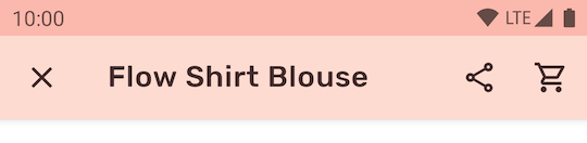
Use the style in the layout, which affects only this top app bar:
<com.google.android.material.appbar.MaterialToolbar
    ...
    app:title="@string/flow_shirt_blouse"
    app:menu="@menu/top_app_bar_shrine"
    app:navigationIcon="@drawable/ic_close_24dp"
    style="@style/Widget.App.Toolbar"
    />
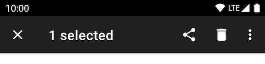
Contextual action bar
Contextual action bars provide actions for selected items.
Anatomy

1. Close button (instead of a navigation icon)
2. Contextual title
3. Contextual actions
4. Overflow menu (optional)
5. Container (not shown)
Key properties
#### Close button attributes
Element | Attribute | Related method(s) | Default value
--------- | -------------------------------------------- | ----------------- | -------------
**Icon** | `app:actionModeCloseDrawable` (in app theme) | N/A | `@drawable/abc_ic_ab_back_material`
**Color** | N/A | N/A | `?attr/colorControlNormal` (as `Drawable` tint)
#### Contextual title attributes
Element | Attribute | Related method(s) | Default value
----------------------- | ----------------------- | ------------------------------ | -------------
**Title text** | N/A | `setTitle``getTitle` | `null` **Subtitle text** | N/A | `setSubtitle`
`getSubtitle` | `null` **Title typography** | `app:titleTextStyle` | N/A | `@style/TextAppearance.Material3.ActionBar.Title` **Subtitle typography** | `app:subtitleTextStyle` | N/A | `@style/TextAppearance.Material3.ActionBar.Subtitle` #### Contextual actions attributes | Element | Attribute | Related method(s) | Default value | |---|---|---|---| | **Menu** | N/A | `menuInflater.inflate` in `ActionMode.Callback` | `null` | | **Icon color** | N/A | N/A | `?attr/colorControlNormal` (as `Drawable` tint) | #### Overflow menu attributes Element | Attribute | Related method(s) | Default value ---------------------------- | ------------------------------------------------------------------------------- | -------------------------------------- | ------------- **Icon** | `android:src` and `app:srcCompat` in `actionOverflowButtonStyle` (in app theme) | `setOverflowIcon`
`getOverflowIcon` | `@drawable/abc_ic_menu_overflow_material` (before API 23) or `@drawable/ic_menu_moreoverflow_material` (after API 23) **Overflow item typography** | `textAppearanceSmallPopupMenu` and `textAppearanceLargePopupMenu` in app theme | N/A | `?attr/textAppearanceTitleMedium` #### Container attributes Element | Attribute | Related method(s) | Default value ------------------ | -------------------------------------------- | ----------------- | ------------- **Color** | `app:background` | N/A | `?attr/actionModeBackground` **Height** | `app:height` | N/A | `?attr/actionBarSize` **Overlay window** | `app:windowActionModeOverlay` (in app theme) | N/A | `false` #### Toolbar logo attributes Element | Attribute | Related method(s) | Default value -------------------- | -------------------------- | ----------------------------------------------------- | ------------- **AdjustViewBounds** | `app:logoAdjustViewBounds` | `setLogoAdjustViewBounds`
`isLogoAdjustViewBounds` | `false` **ScaleType** | `app:logoScaleType` | `setLogoScaleType`
`getLogoScaleType` | ImageView's default #### Styles Element | Style | Theme attribute ----------------- | ----------------------------- | ----------------- **Default style** | `Widget.Material3.ActionMode` | `actionModeStyle`
Adding contextual action bar
API and source code:
* `ActionMode`
* [Class definition](https://developer.android.com/reference/androidx/appcompat/view/ActionMode)
The following example shows a contextual action bar with a contextual title, a
close icon, two contextual action icons, and an overflow menu:
In `res/values/themes.xml`:
```xml
```
In code:
```kt
val callback = object : ActionMode.Callback {
override fun onCreateActionMode(mode: ActionMode?, menu: Menu?): Boolean {
menuInflater.inflate(R.menu.contextual_action_bar, menu)
return true
}
override fun onPrepareActionMode(mode: ActionMode?, menu: Menu?): Boolean {
return false
}
override fun onActionItemClicked(mode: ActionMode?, item: MenuItem?): Boolean {
return when (item?.itemId) {
R.id.share -> {
// Handle share icon press
true
}
R.id.delete -> {
// Handle delete icon press
true
}
R.id.more -> {
// Handle more item (inside overflow menu) press
true
}
else -> false
}
}
override fun onDestroyActionMode(mode: ActionMode?) {
}
}
val actionMode = startSupportActionMode(callback)
actionMode?.title = "1 selected"
```
In `@menu/contextual_action_bar.xml`:
```xml
```
In menu/navigation icons:
```xml
<vector
...
android:tint="?attr/colorControlNormal">
...
</vector>
```
Deprecated app bars
There are two deprecated app bars that are no longer recommended:

- Medium
- Large
The larger collapsing top app bars can be used for longer titles, to house imagery, or to provide a stronger presence to the top app bar.
Medium top app bar
The following example shows a medium collapsing top app bar with a page title, a
navigation icon, an action icon, and an overflow menu.
 In the layout:
```xml
<androidx.coordinatorlayout.widget.CoordinatorLayout
...>
<com.google.android.material.appbar.AppBarLayout
...
android:layout_width="match_parent"
android:layout_height="wrap_content"
android:fitsSystemWindows="true">
In the layout:
```xml
<androidx.coordinatorlayout.widget.CoordinatorLayout
...>
<com.google.android.material.appbar.AppBarLayout
...
android:layout_width="match_parent"
android:layout_height="wrap_content"
android:fitsSystemWindows="true">
Large top app bar
The following example shows a large collapsing top app bar with a page title, a
navigation icon, an action icon, and an overflow menu.
 In the layout:
```xml
<androidx.coordinatorlayout.widget.CoordinatorLayout
...>
<com.google.android.material.appbar.AppBarLayout
...
android:layout_width="match_parent"
android:layout_height="wrap_content"
android:fitsSystemWindows="true">
In the layout:
```xml
<androidx.coordinatorlayout.widget.CoordinatorLayout
...>
<com.google.android.material.appbar.AppBarLayout
...
android:layout_width="match_parent"
android:layout_height="wrap_content"
android:fitsSystemWindows="true">