material-components-android
Side sheets
Side sheets are surfaces containing supplementary content that are anchored to the side of the screen. There are two variants of side sheets.
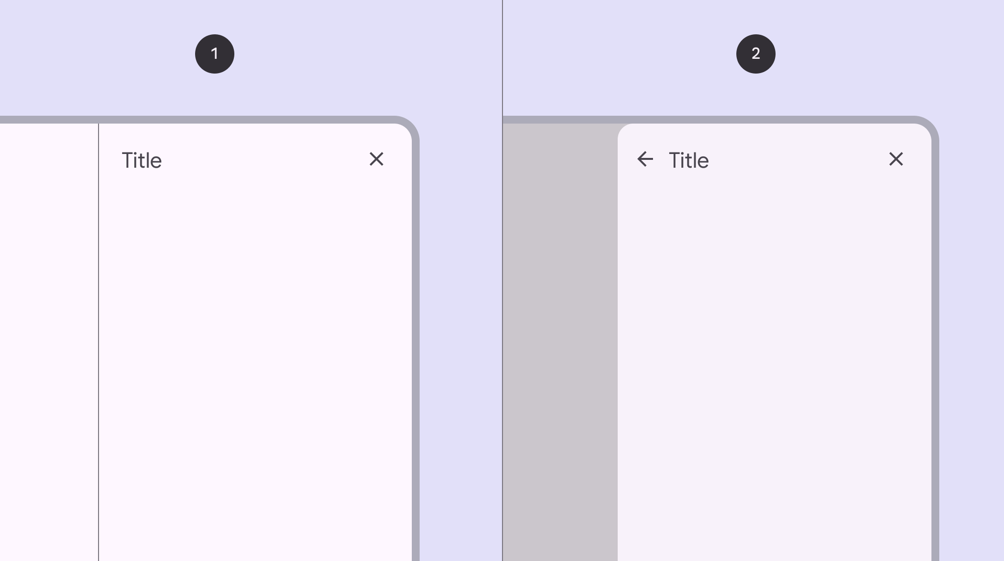
- Standard side sheet
- Modal side sheet
Note: Images use various dynamic color schemes.
Design & API documentation
Anatomy
Standard side sheet
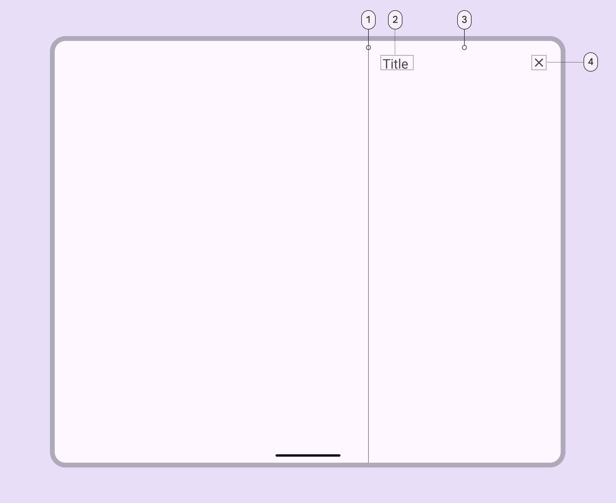
- Divider (optional)
- Headline
- Container
- Close affordance
Modal side sheet
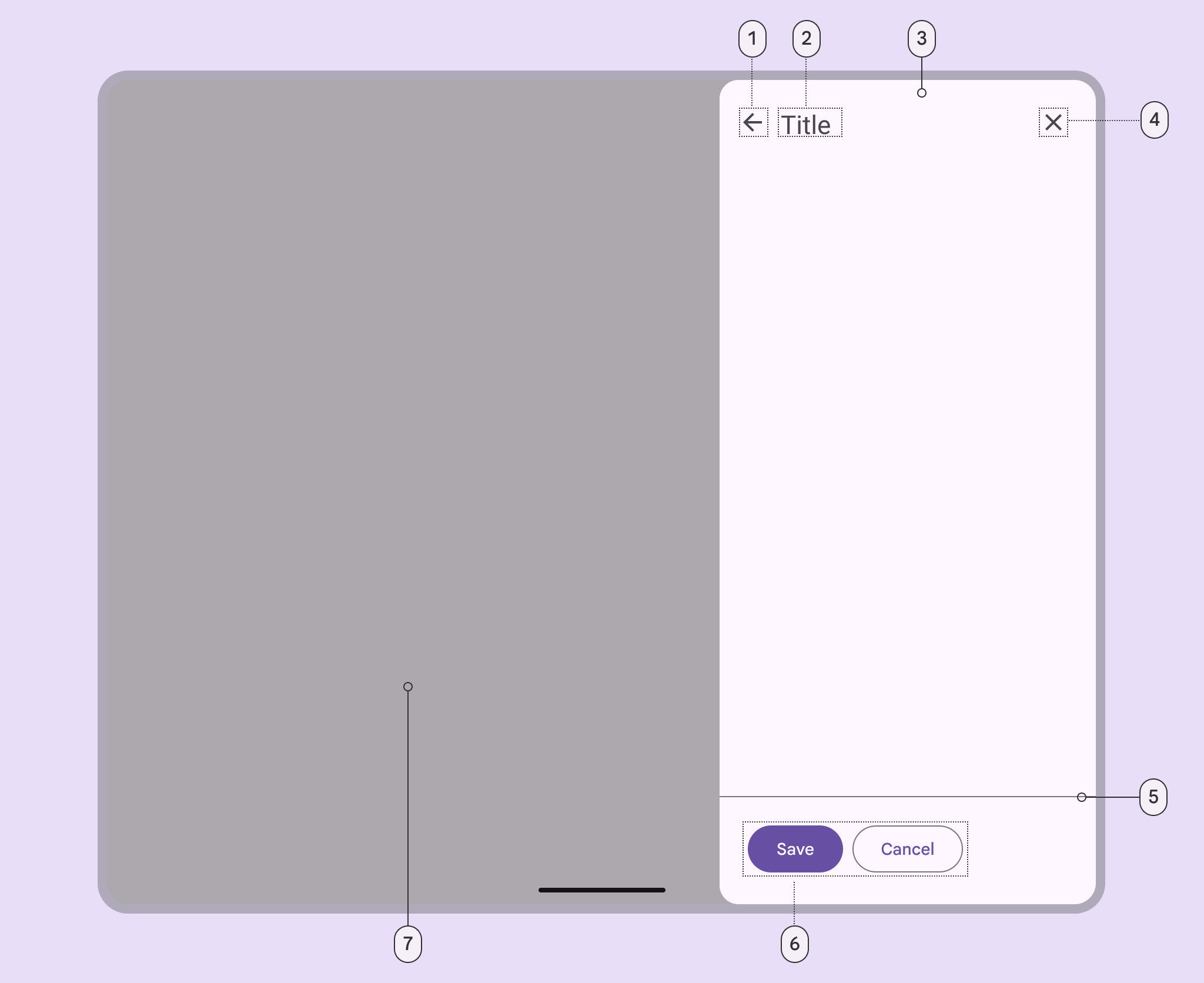
- Back icon button (optional)
- Header
- Container
- Close icon button
- Divider (optional)
- Action (optional)
- Scrim
More details on anatomy items in the component guidelines.
Key properties
Sheet attributes
| Element | Attribute | Related method(s) | Default value |
|---|---|---|---|
| Color | app:backgroundTint |
N/A | ?attr/colorSurface</br>?attr/colorSurfaceContainerLow (modal) |
| Coplanar sibling view id | app:coplanarSiblingViewId |
setCoplanarSiblingViewIdsetCoplanarSiblingView |
N/A |
| Shape | app:shapeAppearance |
N/A | ?attr/shapeAppearanceCornerLarge |
| Sheet edge | android:layout_gravity |
setSheetEdge (modal only) |
end |
| Elevation | android:elevation |
N/A | 0dp |
| Max width | android:maxWidth |
setMaxWidthgetMaxWidth |
N/A |
| Max height | android:maxHeight |
setMaxHeightgetMaxHeight |
N/A |
Behavior attributes
More info about these attributes and how to use them in the setting behavior section.
| Behavior | Related method(s) | Default value |
|---|---|---|
app:behavior_draggable |
setDraggableisDraggable |
true |
Sheet edge
You can set the sheet to originate from the left or right side of the screen.
You can also automatically switch the sheet edge based on layout direction, by
setting the sheet edge to start or end.
Standard and coplanar sheets
To set a standard or coplanar sheet’s edge, set the gravity property of the
side sheet View’s CoordinatorLayout.LayoutParams, then request a layout pass
on the side sheet View.
val layoutParams = sideSheetView.layoutParams
if (layoutParams is CoordinatorLayout.LayoutParams) {
  layoutParams.gravity = sheetGravity
  sideSheetView.requestLayout()
}
You can also set the sheet edge with XML, by setting android:layout_gravity to
the desired gravity:
<FrameLayout
  android:id="@+id/side_sheet_container"
  style="@style/Widget.Material3.SideSheet"
  android:layout_width="256dp"
  android:layout_height="match_parent"
  android:layout_gravity="start"
  app:layout_behavior="@string/side_sheet_behavior">
  <include layout="@layout/side_sheet_layout" />
</FrameLayout>
Modal sheets
To set a modal sheet’s edge, pass a Gravity constant into SideSheetDialog’s
dedicated setSheetEdge method. For example, set the sheet edge to start like
this:
sideSheetDialog.setSheetEdge(Gravity.START)
Note: Runtime changes to sheet edges are not supported for modal sheets and may
not work as expected. If you’d like to change the sheet edge at runtime, you
should recreate the sheet, then call setSheetEdge with the new gravity.
Styles
| Element | Value | Theme attribute |
|---|---|---|
| Standard side sheet style | @style/Widget.Material3.SideSheet |
N/A |
| Modal side sheet style | @style/Widget.Material3.SideSheet.Modal |
?attr/sideSheetModalStyle |
Note: There is no default style theme attribute for standard side sheets,
because SideSheetBehaviors don’t have a designated associated View. Modal
side sheets use ?attr/sideSheetModalStyle as the default style, but there is
no need to set ?attr/sideSheetModalStyle on your modal side sheet layout
because the style is automatically applied to the parent SideSheetDialog.
For the full list, see styles, attributes, and themes and theme overlays.
Variants of side sheets
Standard side sheet
Standard side sheets co-exist with the screen’s main UI region and allow for
simultaneously viewing and interacting with both regions. They are commonly used
to keep a feature or secondary content visible on screen when content in the
main UI region is frequently scrolled or panned.
`SideSheetBehavior` is applied to a child of
[CoordinatorLayout](https://developer.android.com/reference/androidx/coordinatorlayout/widget/CoordinatorLayout)
to make that child a standard side sheet, which is a view that comes up from the
side of the screen, elevated over the main content. It can be dragged vertically
to expose more or less content.
API and source code:
* `SideSheetBehavior`
* [Class definition](https://developer.android.com/reference/com/google/android/material/sidesheet/SideSheetBehavior)
* [Class source](https://github.com/material-components/material-components-android/tree/master/lib/java/com/google/android/material/sidesheet/SideSheetBehavior.java)
Standard side sheet example
`SideSheetBehavior` works in tandem with `CoordinatorLayout` to let you display content in a side sheet, perform enter/exit animations, respond to dragging/swiping gestures, and more. Apply the `SideSheetBehavior` to a direct child `View` of `CoordinatorLayout`: ```xml <androidx.coordinatorlayout.widget.CoordinatorLayout ...>Modal side sheet
Modal side sheets present the sheet while blocking interaction with the rest of
the screen. They are an alternative to inline menus and simple dialogs on mobile
devices, providing additional room for content, iconography, and actions.
Modal side sheets render a scrim on the non-side sheet content, to indicate that
they are modal and block interaction with the rest of the screen. If the content
outside of the dialog is tapped, the side sheet is dismissed. Modal side sheets
can be dragged horizontally and dismissed by sliding them off of the screen.
API and source code:
* `SideSheetDialog`
* [Class definition](https://developer.android.com/reference/com/google/android/material/sidesheet/SideSheetDialog)
* [Class source](https://github.com/material-components/material-components-android/tree/master/lib/java/com/google/android/material/sidesheet/SideSheetDialog.java)
#### Modal side sheet example
To show a modal side sheet, instantiate a `SideSheetDialog` with the desired
`context`:
```kt
val sideSheetDialog = SideSheetDialog(requireContext());
```
Then, you can set the content view of the `SideSheetDialog`:
```kt
sideSheetDialog.setContentView(R.layout.side_sheet_content_layout)
```
You can then show the side sheet with `sideSheetDialog.show()` and dismiss it
with `sideSheetDialog.hide()`. `SideSheetDialog` has built in functionality to
automatically cancel the dialog after it is swiped off the screen.
Code implementation
Before you can use Material side sheets, you need to add a dependency to the Material components for Android library. For more information, go to the Getting started page.
Adding side sheets
Note: Side sheets were introduced in 1.8.0. To use side sheets, make sure
you’re depending on
library version 1.8.0
or later.
Standard side sheet basic usage:
<androidx.coordinatorlayout.widget.CoordinatorLayout
  ...>

  <FrameLayout
    ...
    android:id="@+id/standard_side_sheet"
    app:layout_behavior="com.google.android.material.sidesheet.SideSheetBehavior">

    <!-- Side sheet content. -->

  </FrameLayout>

</androidx.coordinatorlayout.widget.CoordinatorLayout>
Listening to state and slide changes
SideSheetCallbacks can be added to a SideSheetBehavior to listen for state
and slide changes:
val sideSheetCallback = object : SideSheetBehavior.SideSheetCallback() {

    override fun onStateChanged(sideSheet: View, newState: Int) {
        // Do something for new state.
    }

    override fun onSlide(sideSheet: View, slideOffset: Float) {
        // Do something for slide offset.
    }
}

// To add a callback:
sideSheetBehavior.addCallback(sideSheetCallback)

// To remove a callback:
sideSheetBehavior.removeCallback(sideSheetCallback)
Setting behavior
There are several attributes that can be used to adjust the behavior of standard and modal side sheets.
Behavior attributes can be applied to standard side sheets in xml by setting
them on a child View set to app:layout_behavior, or programmatically:
val standardSideSheetBehavior = SideSheetBehavior.from(standardSideSheet)
// Use this to programmatically apply behavior attributes
More information about these attributes and their default values is available in the behavior attributes section.
Setting state
Standard side sheets have the following states:
STATE_EXPANDED: The side sheet is visible at its maximum height and it is neither dragging nor settling (see below).STATE_HIDDEN: The side sheet is no longer visible and can only be re-shown programmatically.STATE_DRAGGING: The user is actively dragging the side sheet.STATE_SETTLING: The side sheet is settling to a specific height after a drag/swipe gesture. This will be the peek height, expanded height, or 0, in case the user action caused the side sheet to hide.
You can set a state on the side sheet:
sideSheetBehavior.state = Sheet.STATE_HIDDEN
Note: STATE_SETTLING and STATE_DRAGGING should not be set
programmatically.
Predictive back
Standard and coplanar (non-modal) side sheets
To set up predictive back for standard or coplanar (non-modal) side sheets using
SideSheetBehavior, create an AndroidX back callback that forwards
BackEventCompat objects to your SideSheetBehavior:
val sideSheetBackCallback = object : OnBackPressedCallback(/* enabled= */false) {
  override fun handleOnBackStarted(backEvent: BackEventCompat) {
    sideSheetBehavior.startBackProgress(backEvent)
  }

  override fun handleOnBackProgressed(backEvent: BackEventCompat) {
    sideSheetBehavior.updateBackProgress(backEvent)
  }

  override fun handleOnBackPressed() {
    sideSheetBehavior.handleBackInvoked()
  }

  override fun handleOnBackCancelled() {
    sideSheetBehavior.cancelBackProgress()
  }
}
And then add and enable the back callback as follows:
getOnBackPressedDispatcher().addCallback(this, sideSheetBackCallback)

sideSheetBehavior.addCallback(object : SideSheetCallback() {
  override fun onStateChanged(sideSheet: View, newState: Int) {
    when (newState) {
      STATE_EXPANDED, STATE_SETTLING -> sideSheetBackCallback.setEnabled(true)
      STATE_HIDDEN -> sideSheetBackCallback.setEnabled(false)
      else -> {
        // Do nothing, only change callback enabled for above states.
      }
    }
  }

  override fun onSlide(sideSheet: View, slideOffset: Float) {}
})
Modal side sheets
The modal SideSheetDialog component automatically supports
predictive back.
No further integration is required on the app side other than the general
predictive back prerequisites and migration steps mentioned
here.
Visit the predictive back design guidelines to see how the component behaves when a user swipes back.
Customizing side sheets
Theming side sheets
Side sheets support the customization of color, shape, and more.
Side sheet theming example
API and source code:
SideSheetBehaviorSideSheetDialog
Setting the theme attribute sideSheetDialogTheme to your custom ThemeOverlay
will affect all side sheets.
In res/values/themes.xml:
<style name="Theme.App" parent="Theme.Material3.*">
  ...
  <item name="sideSheetDialogTheme">@style/ThemeOverlay.App.SideSheetDialog</item>
</style>

<style name="ThemeOverlay.App.SideSheetDialog" parent="ThemeOverlay.Material3.SideSheetDialog">
    <item name="sideSheetModalStyle">@style/Widget.App.SideSheet.Modal</item>
</style>
In res/values/styles.xml:
<style name="Widget.App.SideSheet.Modal" parent="Widget.Material3.SideSheet.Modal">
    <item name="backgroundTint">@color/shrine_pink_light</item>
    <item name="shapeAppearance">@style/ShapeAppearance.App.Corner.Large</item>
</style>

<style name="ShapeAppearance.App.Corner.Large" parent="ShapeAppearance.Material3.Corner.Large">
    <item name="cornerFamily">cut</item>
    <item name="cornerSize">24dp</item>
</style>
Note: The benefit of using a custom ThemeOverlay is that any changes to
your main theme, such as updated colors, will be reflected in the side sheet, as
long as they’re not overridden in your custom theme overlay. If you use a custom
Theme instead, by extending from one of the
Theme.Material3.*.SideSheetDialog variants, you will have more control over
exactly what attributes are included in each, but it also means you’ll have to
duplicate any changes that you’ve made in your main theme into your custom
theme.