material-components-android
Search
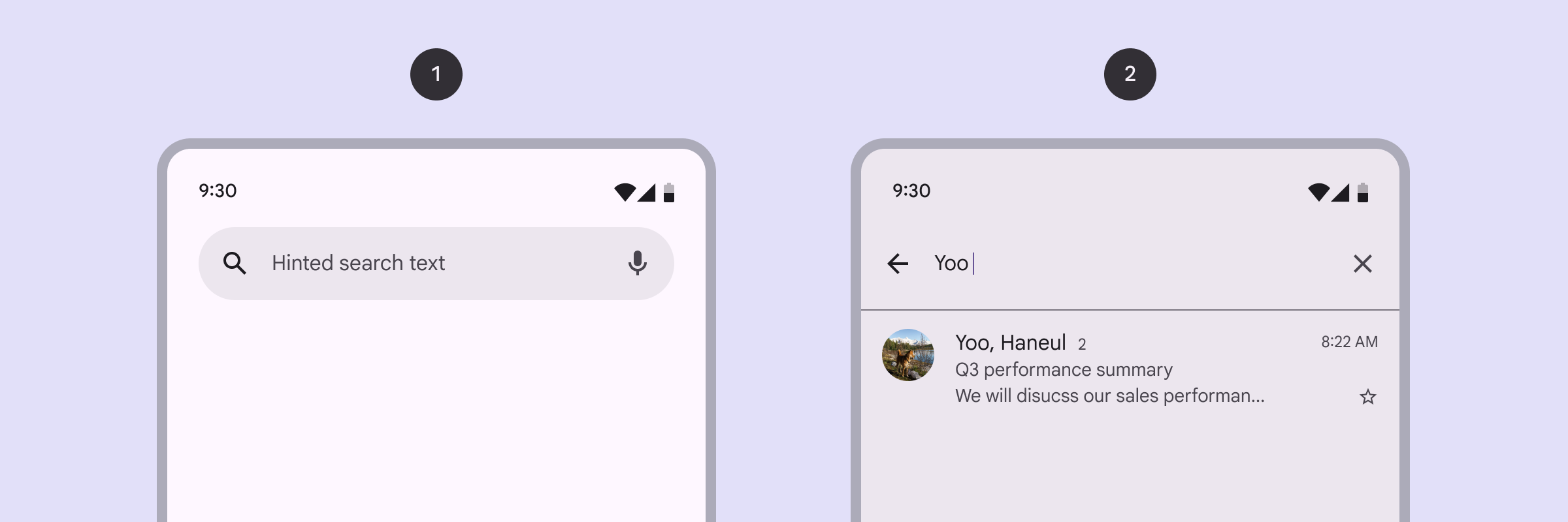
Search is a navigation method that allows people to quickly find information across an app. Users input a query into the search bar or text field of the search view and then see related results.
- Search bar
- Search view
Search bar is a persistent and prominent search field at the top of the screen and search view is a full-screen modal typically opened by selecting a search icon.
Note: Images use various dynamic color schemes.
Design & API documentation
Anatomy
Search bar

- Container
- Leading icon button
- Supporting text
- Avatar or trailing icon (optional)
Search view
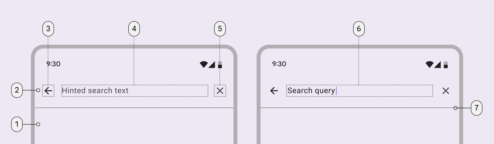
- Container
- Header
- Leading icon button
- Supporting text
- Trailing icon button
- Input text
- Divider
More details on anatomy items in the component guidelines.
M3 Expressive
M3 Expressive update
SearchBar updates
- New Centered Search Text attribute
- New Maximum Width
- New Lift on Scroll Color attribute
- Padding and inset updates
M3 Expressive styles
The default style for SearchBar is:
<item name="materialSearchBarStyle">@style/Widget.Material3Expressive.SearchBar</item>
You can also set a centered style with:
<item name="materialSearchBarStyle">@style/Widget.Material3Expressive.SearchBar.CenteredText</item>
The recommended way to display a SearchBar is now inside of an AppBarLayout.
You can specify
android:theme="ThemeOverlay.Material3Expressive.AppBarWithSearch" on your
AppBarLayout to style your AppBarLayout and SearchBar automatically as an
AppBar with Search.
The default SearchBar style for this theme overlay is the centered text
configuration. If you would like to specify a start-aligned text SearchBar,
you must additionally set the following style explicitly on the SearchBar:
@style/Widget.Material3Expressive.SearchBar.AppBarWithSearch.
If migrating your SearchBar layout to the AppBar with Search configuration is
difficult due to the manual addition of MaterialButtons, there is a mitigation
in place to keep the same inputs. See
SearchBar in MaterialToolbar.
SearchBar in MaterialToolbar
As the new AppBar with Search configuration moves icons from inside of the
SearchBar to outside of it, clients are expected to add their own
MaterialButtons replacing these icons inside of the AppBarLayout.
As this may not always be easy for existing clients, an approach using a
MaterialToolbar is supported to add icons outside of the SearchBar with the
same inputs.
Simply wrap the SearchBar inside of a MaterialToolbar and apply the leading
and trailing icons to the MaterialToolbar instead of the SearchBar in the
same manner.
For example:
  <com.google.android.material.appbar.AppBarLayout
      android:id="@+id/app_bar_layout"
      android:layout_width="match_parent"
      android:layout_height="wrap_content"
      android:fitsSystemWindows="true"
      app:materialThemeOverlay="@style/ThemeOverlay.Material3Expressive.AppBarWithSearch"
      app:statusBarForeground="?attr/colorSurface">
    <com.google.android.material.appbar.MaterialToolbar
        android:id="@+id/toolbar"
        android:layout_width="match_parent"
        android:layout_height="wrap_content"
        app:navigationIcon="@drawable/ic_home_checkable_24px"
        app:layout_scrollFlags="enterAlways|scroll|snap"
        app:navigationContentDescription="@string/home_icon_description"
        app:menu="@menu/search_menu">
      <com.google.android.material.search.SearchBar
          android:id="@+id/search_bar"
          android:layout_width="match_parent"
          android:layout_height="wrap_content"
          android:layout_marginEnd="8dp"
          android:layout_marginStart="8dp"
          android:hint="@string/searchbar_hint">
      </com.google.android.material.search.SearchBar>
    </com.google.android.material.appbar.MaterialToolbar>
  </com.google.android.material.appbar.AppBarLayout>
Key properties
Search bar
Attributes
The following attributes can be changed for SearchBar:
| Element | Attribute | Related method(s) | Default value |
|---|---|---|---|
| Max Width | android:maxWidth |
setMaxWidthgetMaxWidth |
-1 (unset) |
| Flag for enabling adaptive max width | app:adaptiveMaxWidthEnabled |
– | false |
| Min height | android:minHeight |
setMinHeightgetMinHeight |
@dimen/m3_searchbar_height |
| Search text appearance | android:textAppearance |
setTextAppearancegetTextAppearance |
@style/TextAppearance.Material3.SearchBar |
| Search text | android:text |
setTextgetText |
null |
| Search hint | android:hint |
setHintgetHint |
null |
| Search text centered | app:textCentered |
setTextCenteredgetTextCentered |
false |
| Color | app:backgroundTint |
– | ?attr/colorSurfaceContainerHigh |
| Lift On Scroll | app:liftOnScroll |
– | false |
| Lift On Scroll Color | app:liftOnScrollColor |
– | ?attr/colorSurfaceContainerHighest |
| Flag for default margins | app:defaultMarginsEnabled |
– | true |
| Flag for navigation icon | app:hideNavigationIcon |
– | false |
Styles
| Element | Style | Theme attribute |
|---|---|---|
| Search Bar Default style | Widget.Material3.SearchBar |
?attr/materialSearchBarStyle |
| Search View Toolbar style | Widget.Material3.SearchView.Toolbar |
?attr/materialSearchViewToolbarStyle |
| Search View Toolbar height | @dimen/m3_searchview_height |
?attr/materialSearchViewToolbarHeight |
Search view
Attributes
The following attributes can be changed for SearchView:
| Element | Attribute | Related method(s) | Default value |
|---|---|---|---|
| Search text appearance | android:textAppearance |
setTextAppearancegetTextAppearance |
@style/TextAppearance.Material3.SearchBar |
| Search text | android:text |
setTextgetText |
null |
| Search hint | android:hint |
setHintgetHint |
null |
| Color | app:backgroundTint |
– | ?attr/colorSurfaceContainerHigh |
| Flag for navigation icon | app:hideNavigationIcon |
– | true |
Flag for DrawerArrowDrawable |
app:useDrawerArrowDrawable |
– | false |
| Flag for soft keyboard | app:autoShowKeyboard |
– | true |
| Flag for divider | app:dividerVisible |
– | true |
Styles
| Element | Style | Theme attribute |
|---|---|---|
| Search View Default style | Widget.Material3.SearchView |
?attr/materialSearchViewStyle |
Code implementation
Before you can use the Material Search components, you need to add a dependency to the Material components for Android library. For more information, go to the Getting started page.
Note: Material Search was introduced in 1.8.0. To use Material Search, make
sure you’re depending on
library version 1.8.0
or later.
API and source code
Adding Search bar
The SearchBar component provides an implementation of the floating search
field. It extends Toolbar, so it supports a navigation icon, menu items, and
any other Toolbar APIs. Additionally, the SearchBar comes with a hint
TextView and supports nesting a centered branding element.
Since SearchBar extends Toolbar, you can set up your SearchBar as an
ActionBar via
AppCompatActivity#setSupportActionBar,
and inflate a menu by overriding the onCreateOptionsMenu method. However, if
using the default magnifying glass navigationIcon, you may need to set
app:forceDefaultNavigationOnClickListener="true" on your SearchBar so that
the search icon doesn’t act as a back button due to the Activity’s ActionBar
setup flow.
Alternatively, you can choose to not set up your SearchBar as an ActionBar,
and instead just use Toolbar’s inflateMenu and setOnMenuItemClickListener
methods:
searchBar.inflateMenu(R.menu.searchbar_menu);
searchBar.setOnMenuItemClickListener(
    menuItem -> {
      // Handle menuItem click.
      return true;
    });
Note: SearchBar aims to provide a consistent search bar across all apps, so it
does not support setting a custom background via android:background.
API and source code:
SearchBar
Adding Search view
The SearchView component provides an implementation of a full-screen search
view which can be used to display back navigation, a search hint and text, menu
items, and search suggestions and results. It also comes with a clear text
button that shows and hides depending on whether the user has entered text.
To set up a menu for your SearchView, you can use the inflateMenu and
setOnMenuItemClickListener methods:
searchView.inflateMenu(R.menu.search_view_menu);
searchView.setOnMenuItemClickListener(
    menuItem -> {
      // Handle menuItem click.
      return true;
    });
Additionally, SearchView exposes its main EditText via a getEditText()
method, so you can use any of the traditional
EditText APIs
to configure the search field (setText(), addTextChangedListener(), etc.).
Here is an example of how you can carry over the search text to the SearchBar,
as well as hide the SearchView when the user finishes typing and presses
enter:
searchView
    .getEditText()
    .setOnEditorActionListener(
        (v, actionId, event) -> {
          searchBar.setText(searchView.getText());
          searchView.hide();
          return false;
        });
Making search components accessible
You should set a content description on a search bar and search view components
via the android:contentDescription attribute or setContentDescription method
so that screen readers such as TalkBack are able to announce their purpose or
action. Text rendered in these components are automatically provided to
accessibility services, so additional content labels are usually unnecessary.
SearchView also automatically handles its siblings’ accessibility when shown,
i.e., setting views that are not nested within the SearchView as not important
for accessibility. These values are restored when the SearchView is hidden.
Note SearchView handles its siblings’ accessibility by saving the original
values when SearchView is shown, and restoring them when it’s hidden. If
changing the view hierarchy of the SearchView’s root view, make sure to call
setModalForAccessibility(false) to restore the original a11y values. Eg. if
removing the SearchView when open, you must call
setModalForAccessibility(false) before removal to ensure that the original
a11y values are restored since SearchView.hide() will never be called.
Transition listeners
If you want to get callbacks for when the SearchView transitions between its
different animation states, you can add an SearchView.TransitionListener via
the SearchView#addTransitionListener method. E.g.:
searchView.addTransitionListener(
    (searchView, previousState, newState) -> {
      if (newState == TransitionState.SHOWING) {
        // Handle search view opened.
      }
    });
Predictive back
The SearchView component automatically supports
predictive back
when it is set up with and connected to a SearchBar, as mentioned in the
sections above. No further integration is required on the app side other than
the general predictive back prerequisites and migration steps mentioned
here.
Visit the predictive back design guidelines to see how the component behaves when a user swipes back.
Customizing search bar
Expand and collapse animations
One of the biggest advantages of using the SearchView in conjunction with an
SearchBar is that you will get the expand and collapse animations for free. If
you are just using a standalone SearchView without an SearchBar, then
showing or hiding the SearchView will result in slide up and slide down
transitions.
Soft input modes
The recommended windowSoftInputMode when using an SearchBar and an
SearchView is adjustNothing. There are a couple reasons for this:
- The
adjustResizemode causes the screen to resize when the keyboard is shown, which can cause glitchiness during the expand and collapse animations.SearchViewdoes address this by staggering the showing and hiding of the keyboard with the animations; however, the preferred approach is to useadjustNothingso the keyboard can be shown and hidden immediately. - Resizing the screen is not usually helpful to the user during search. The
user can either keep typing to see more results or start scrolling, in which
case the
SearchViewwill automatically dismiss the keyboard to show the rest of the screen.
On initial render, the SearchView will get the soft input mode from the
Window, so that it can set up the above behavior. If you change the soft input
mode at runtime, make sure to also invoke the SearchView#setSoftInputMode
method so that the SearchView can adjust its behavior accordingly.
Lastly, if you don’t want the soft keyboard to show automatically when the
SearchView is shown, you can set app:autoShowKeyboard="false" on your
SearchView.
Translucent status bar
SearchBar and SearchView come with support for a translucent status bar.
To make sure that the SearchBar doesn’t appear underneath the translucent
status bar, you can wrap it in a FrameLayout which has the
android:fitsSystemWindows attribute set to true.
Additionally, you should not set the android:fitsSystemWindows attribute on
the SearchView. If you are using either FLAG_TRANSLUCENT_STATUS
(android:windowTranslucentStatus) or FLAG_LAYOUT_NO_LIMITS, then the
SearchView will automatically add an extra spacer surface so that it fills the
space underneath the translucent status bar.
Menu to back arrow animation
If you are using the SearchBar with a NavigationDrawer, you can set the
app:useDrawerArrowDrawable attribute to true on your SearchView to enable
the “hamburger” menu to back arrow icon animation. This animation will happen
during the expand and collapse of the SearchView.
Search prefix
If you would like to show some prefix text before the main search EditText,
you can make use of the app:searchPrefixText attribute. For example, setting
app:searchPrefixText="To:" on your SearchView will result in the fixed text
label, “To:”, being shown before the search EditText.
Additionally, with this pattern it is common to hide the back button to reduce
clutter, as navigation can be handled outside of the search view. This can be
accomplished by setting app:hideNavigationIcon="true" on your SearchView.
Search history, suggestions, and results
SearchView is a view group component, meaning you can nest content inside of
it such as:
- Search history when the
SearchViewis first expanded - Search suggestions when the user is typing
- Search results once the user submits the search
  <com.google.android.material.search.SearchView
      android:layout_width="match_parent"
      android:layout_height="match_parent"
      android:hint="@string/searchbar_hint"
      app:layout_anchor="@id/search_bar">

    <!-- Search suggestions/results go here (ScrollView, RecyclerView, etc.). -->

  </com.google.android.material.search.SearchView>
Scrolling behavior
The SearchBar can either be used as a fixed, scroll-away, or lift on scroll
search field.
Fixed mode
To set up the fixed mode, simply position the SearchBar on top of the rest of
your layout’s contents and do not set up any scrolling behaviors or
AppBarLayout. The SearchBar will remain fixed in place as the content is
scrolled beneath it.
Scroll-away mode
To set up the scroll-away mode, use a top-level CoordinatorLayout and place
the SearchBar within an AppBarLayout. Then, place the AppBarLayout below
the scrolling view (usually a RecyclerView or NestedScrollView) in the
CoordinatorLayout, and set
app:layout_behavior="@string/searchbar_scrolling_view_behavior" on the
scrolling view. This scrolling behavior makes the AppBarLayout transparent and
not elevated so there are no undesirable shadows. It also adjusts the scrolling
child so that the SearchBar will overlap the rest of your content and appear
to be floating above it. See the
putting it all together section below for an example
of how to set up this behavior.
Additionally, if your app is going edge-to-edge, consider adding
app:statusBarForeground="?attr/colorSurface" to your AppBarLayout in order
to avoid overlap between the SearchBar and status bar content on scroll.
Lift on scroll mode
To set up the lift on scroll mode, use a top-level CoordinatorLayout and place
the SearchBar within an AppBarLayout. Then, place the AppBarLayout below
the scrolling view (usually a RecyclerView or NestedScrollView) in the
CoordinatorLayout, and set
app:layout_behavior="@string/appbar_scrolling_view_behavior" on the scrolling
view. On the SearchBar, set app:liftOnScroll=true and set a
app:liftOnScrollColor to change the color of the SearchBar as the
AppBarLayout is lifting.
See the putting it all together section below for an example of how to set up this behavior.
Putting it all together
Putting it all together and using the scroll-away mode, the SearchBar and
SearchView widgets can be used in your layout as such:
<androidx.coordinatorlayout.widget.CoordinatorLayout
    android:layout_width="match_parent"
    android:layout_height="match_parent">

  <!-- NestedScrollingChild goes here (NestedScrollView, RecyclerView, etc.). -->
  <androidx.core.widget.NestedScrollView
      android:layout_width="match_parent"
      android:layout_height="match_parent"
      app:layout_behavior="@string/searchbar_scrolling_view_behavior">
    <!-- Screen content goes here. -->
  </androidx.core.widget.NestedScrollView>

  <com.google.android.material.appbar.AppBarLayout
      android:layout_width="match_parent"
      android:layout_height="wrap_content">
    <com.google.android.material.search.SearchBar
        android:id="@+id/search_bar"
        android:layout_width="match_parent"
        android:layout_height="wrap_content"
        android:hint="@string/searchbar_hint" />
  </com.google.android.material.appbar.AppBarLayout>

  <com.google.android.material.search.SearchView
      android:layout_width="match_parent"
      android:layout_height="match_parent"
      android:hint="@string/searchbar_hint"
      app:layout_anchor="@id/search_bar">

    <!-- Search suggestions/results go here (ScrollView, RecyclerView, etc.). -->

  </com.google.android.material.search.SearchView>
</androidx.coordinatorlayout.widget.CoordinatorLayout>
By placing the SearchBar and SearchView within a CoordinatorLayout and
using the app:layout_anchor tag, they will get automatically hooked up. This
sets up the behavior of showing the SearchView when the SearchBar is tapped,
as well as the expand and collapse animations. If you can’t use a
CoordinatorLayout, instead you can call the SearchView#setUpWithSearchBar
method to achieve the same result.
Alternatively, an example of the lift on scroll mode is below:
<androidx.coordinatorlayout.widget.CoordinatorLayout
    android:layout_width="match_parent"
    android:layout_height="match_parent">

  <!-- NestedScrollingChild goes here (NestedScrollView, RecyclerView, etc.). -->
  <androidx.core.widget.NestedScrollView
      android:layout_width="match_parent"
      android:layout_height="match_parent"
      app:layout_behavior="@string/appbar_scrolling_view_behavior">
    <!-- Screen content goes here. -->
  </androidx.core.widget.NestedScrollView>

  <com.google.android.material.appbar.AppBarLayout
      android:layout_width="match_parent"
      android:layout_height="wrap_content">
    <com.google.android.material.search.SearchBar
        android:id="@+id/search_bar"
        android:layout_width="match_parent"
        android:layout_height="wrap_content"
        android:hint="@string/searchbar_hint"
        app:liftOnScroll="true"
        app:liftOnScrollColor="?attr/colorSurfaceContainerHighest"/>
  </com.google.android.material.appbar.AppBarLayout>

  <com.google.android.material.search.SearchView
      android:layout_width="match_parent"
      android:layout_height="match_parent"
      android:hint="@string/searchbar_hint"
      app:layout_anchor="@id/search_bar">

    <!-- Search suggestions/results go here (ScrollView, RecyclerView, etc.). -->

  </com.google.android.material.search.SearchView>
</androidx.coordinatorlayout.widget.CoordinatorLayout>
Toolbar transitions
The SearchBar component also provides transitions to and from a Toolbar,
e.g., for a contextual multi-select flow. These transitions are implemented as
expand and collapse animations, and can be started by calling SearchBar#expand
and SearchBar#collapse, respectively. Additionally, if you are using an
AppBarLayout in conjunction with the SearchBar, you may pass in a reference
to your AppBarLayout to these methods so that its visibility and offset can be
taken into account for the animations.
Lastly, make sure to add the following to your back pressed handling method, in
order to collapse the contextual Toolbar into the SearchBar when the user
presses the system back button:
if (searchBar.collapse(contextualToolbar, appBarLayout)) {
  // Clear selection.
  return;
}