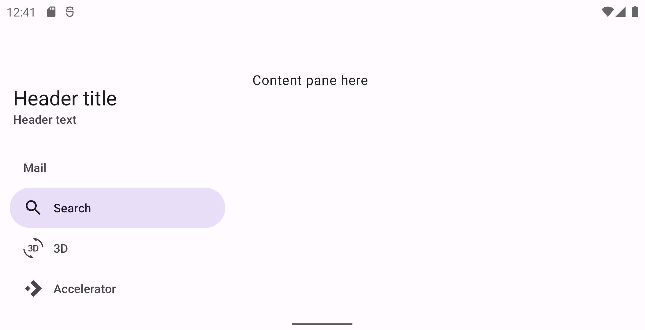
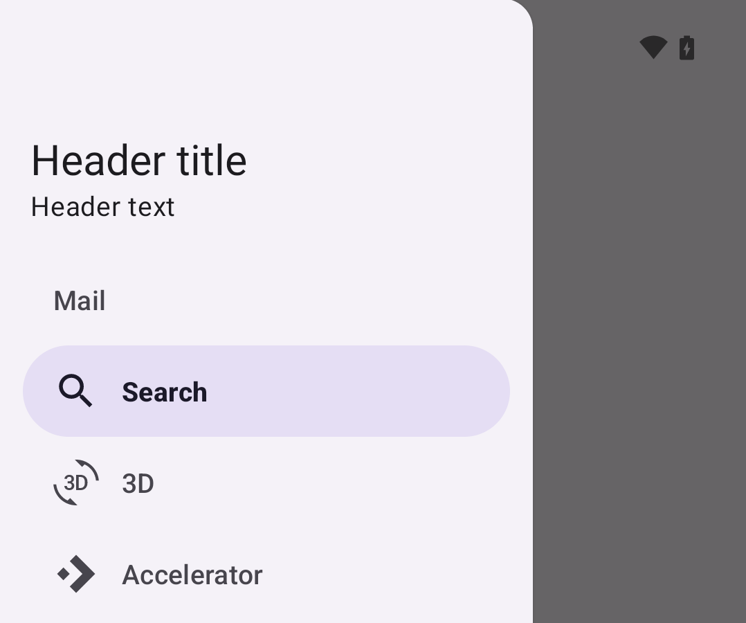
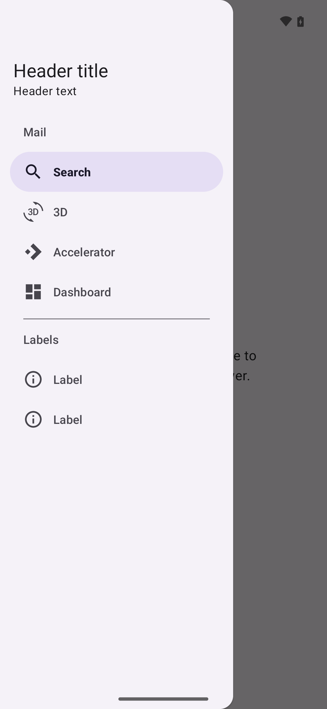
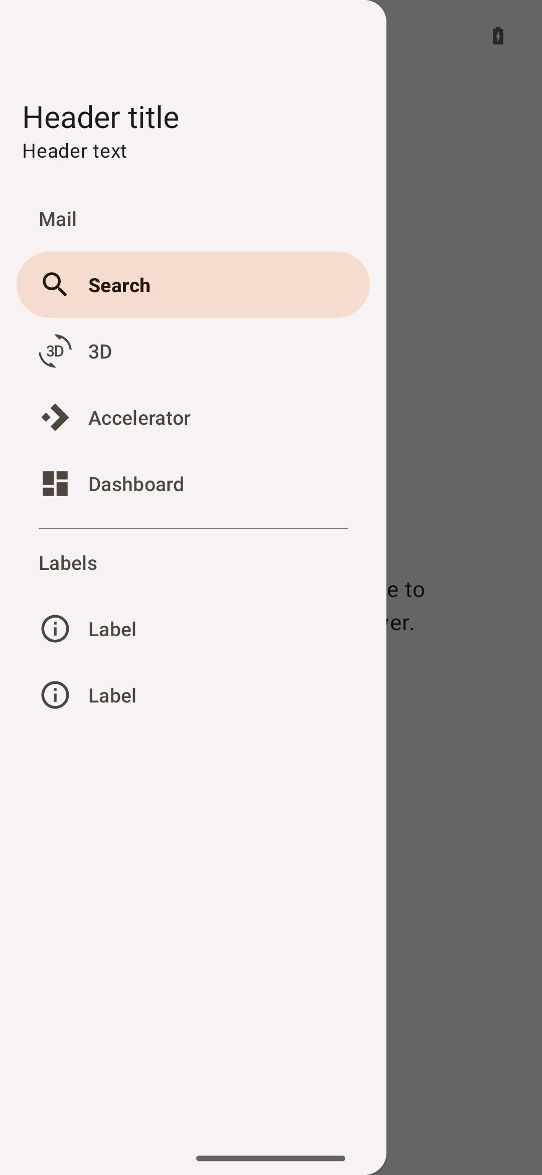
Navigation drawers
Note: The navigation drawer is being deprecated in the Material 3 expressive
update. For those who have updated, use an expanded navigation rail, which has
mostly the same functionality of the navigation drawer and adapts better across
window size classes.
Navigation drawers
provide access to destinations in your app. There are two variants of navigation
drawers.
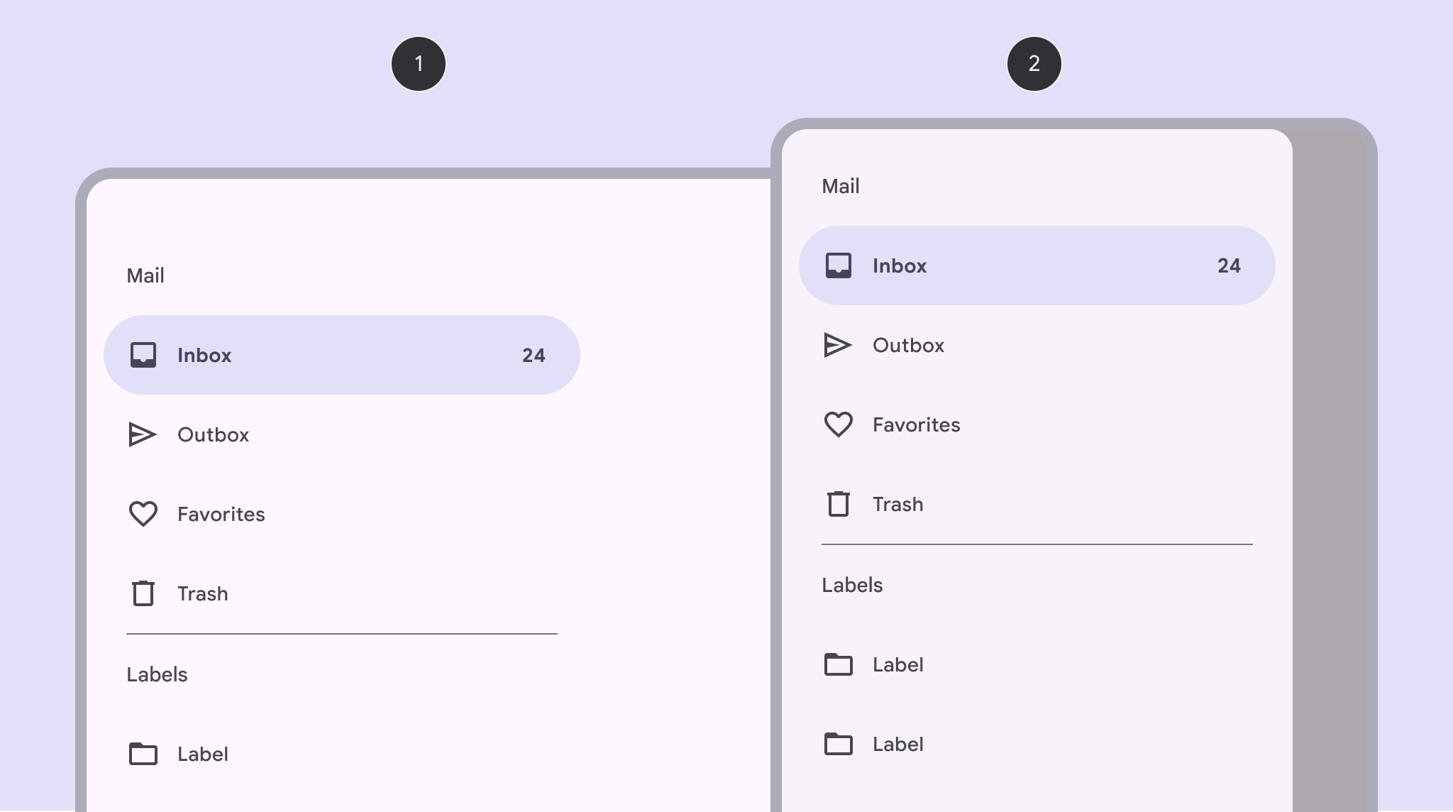
- Standard navigation drawer
- Modal navigation drawer
Note: Images use various dynamic color schemes.
Design & API documentation
Anatomy
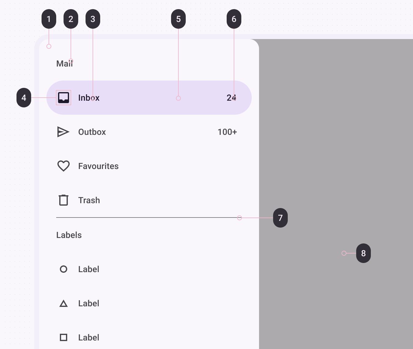
- Container
- Headline
- Label text
- Icon
- Active indicator
- Badge label text
- Scrim
More details on anatomy items are available in the
component guidelines.
M3 Expressive update
The navigation drawer is being deprecated. Use the expanded navigation rail
instead. More on M3 Expressive
Key properties
Container attributes
| Element |
Attribute(s) |
Related method(s) |
Default value |
| Color |
android:background |
setBackground
getBackground |
?attr/colorSurfaceContainerLow |
| Shape |
app:shapeAppearance
app:shapeAppearanceOverlay |
N/A |
null |
| Elevation |
app:elevation (can be used on NavigationView or DrawerLayout) |
setElevation
getElevation |
0dp (NavigationView) or 1dp (DrawerLayout) |
| Max width |
android:maxWidth |
N/A |
280dp |
| Fits system windows |
android:fitsSystemWindows |
setFitsSystemWindows
getFitsSystemWindows |
true |
| Drawer corner size |
drawerLayoutCornerSize |
N/A |
16dp |
| Element |
Attribute |
Related method(s) |
Default value |
| Layout |
app:headerLayout |
addHeaderView
inflateHeaderView
getHeaderView
getHeaderCount
removeHeaderView |
null |
Divider attributes
| Element |
Attribute |
Related method(s) |
Default value |
| Divider |
android:listDivider in app theme |
N/A |
Varies per platform version |
| Height |
N/A (see layout) |
N/A |
1dp |
| Inset |
app:dividerInsetStart
app:dividerInsetEnd |
setDividerInsetStart
getDividerInsetStart
setDividerInsetEnd
getDividerInsetEnd |
28dp
28dp |
Item attributes
| Element |
Attribute(s) |
Related method(s) |
Default value |
| Color |
app:itemShapeFillColor |
N/A |
?attr/colorSecondaryContainer |
| Shape |
app:itemShapeAppearance
app:itemShapeAppearanceOverlay |
N/A |
@style/ShapeAppearance.Material3.Corner.Full
(?attr/shapeCornerFamily and corner size 50%) |
| Insets |
app:itemShapeInsetStart
app:itemShapeInsetTop
app:itemShapeInsetEnd
app:itemShapeInsetBottom |
N/A |
12dp
0dp
12dp
0dp |
| Horizontal padding |
app:itemHorizontalPadding |
setItemHorizontalPadding
setItemHorizontalPaddingResource
getItemHorizontalPadding |
28dp |
| Vertical padding |
app:itemVerticalPadding |
setItemVerticalPadding
setItemVerticalPaddingResource
getItemVerticalPadding |
4dp |
Text attributes
| Element |
Attribute |
Related method(s) |
Default value |
| Color |
app:itemTextColor |
setItemTextColor
getItemTextColor |
?attr/colorOnSecondaryContainer when active else ?attr/colorOnSurfaceVariant |
| Typography |
app:itemTextAppearance |
setItemTextAppearance |
?attr/textAppearanceLabelLarge |
| Typography (active) |
app:itemTextAppearanceActiveBoldEnabled |
setItemTextAppearanceActiveBoldEnabled |
true |
| Max lines |
app:itemMaxLines |
setItemMaxLines
getItemMaxLines |
1 |
Icon attributes
| Element |
Attribute |
Related method(s) |
Default value |
| Color |
app:itemIconTint |
setIconItemTintList
getIconItemTintList |
?attr/colorOnSecondaryContainer when active else ?attr/colorOnSurfaceVariant |
| Size |
app:itemIconSize |
setItemIconSize |
24dp |
| Padding |
app:itemIconPadding |
setItemIconPadding
setItemIconPaddingResource
getItemIconPadding |
12dp |
Subtitle attributes
| Element |
Attribute |
Related method(s) |
Default value |
| Color |
app:subheaderColor |
N/A |
?attr/colorOnSurfaceVariant |
| Typography |
app:subheaderTextAppearance |
N/A |
?attr/textAppearanceTitleSmall |
| Max lines |
N/A |
N/A |
1 |
| Height |
N/A |
N/A |
?attr/listPreferredItemHeightSmall |
| Padding |
app:subheaderInsetStart
app:subheaderInsetEnd |
setSubheaderInsetStart
getSubheaderInsetStart
setSubheaderInsetEnd
getSubheaderInsetEnd |
28dp and 28dp |
Scrim attributes
| Element |
Attribute |
Related method(s) |
Default value |
| Color |
N/A |
setScrimColor on DrawerLayout |
Black at 60% opacity |
| Window Insets |
app:topInsetScrimEnabled
app:bottomScrimEnabled
app:startScrimEnabled
app:endScrimEnabled |
setTopInsetScrimEnabled
isTopInsetScrimEnabled
setBottomInsetScrimEnabled
isBottomInsetScrimEnabled
setStartInsetScrimEnabled
isStartInsetScrimEnabled
setEndInsetScrimEnabled
isEndInsetScrimEnabled |
true |
NavigationView styles
| Element |
Style |
Theme attribute |
| Default style |
Widget.Material3.NavigationView |
?attr/navigationViewStyle |
DrawerLayout styles
| Element |
Style |
Theme attribute |
| Default style |
Widget.Material3.DrawerLayout |
?attr/drawerLayoutStyle |
Variants of navigation drawer
Standard navigation drawer
[Standard navigation drawers](https://material.io/components/navigation-drawer#standard-drawer)
allow interaction with both screen content and the drawer at the same time. They
can be used on tablet and desktop, but they aren’t suitable for mobile devices
due to limited screen size.
API and source code:
* `NavigationView`
* [Class definition](https://developer.android.com/reference/com/google/android/material/navigation/NavigationView)
* [GitHub source](https://github.com/material-components/material-components-android/tree/master/lib/java/com/google/android/material/navigation/NavigationView.java)
#### Standard navigation drawer example
The following example shows a permanently visible standard navigation drawer.
 In the layout:
```xml
<androidx.constraintlayout.widget.ConstraintLayout
...
android:layout_width="match_parent"
android:layout_height="match_parent">
<com.google.android.material.navigation.NavigationView
...
android:layout_width="wrap_content"
android:layout_height="match_parent"
app:layout_constraintStart_toStartOf="parent" />
</androidx.constraintlayout.widget.ConstraintLayout>
```
In `res/values/themes.xml`:
```xml
```
In `res/layout/header_navigation_drawer.xml`:
```xml
<LinearLayout
...
android:fitsSystemWindows="true">
...
</LinearLayout>
```
In the layout:
```xml
<androidx.constraintlayout.widget.ConstraintLayout
...
android:layout_width="match_parent"
android:layout_height="match_parent">
<com.google.android.material.navigation.NavigationView
...
android:layout_width="wrap_content"
android:layout_height="match_parent"
app:layout_constraintStart_toStartOf="parent" />
</androidx.constraintlayout.widget.ConstraintLayout>
```
In `res/values/themes.xml`:
```xml
```
In `res/layout/header_navigation_drawer.xml`:
```xml
<LinearLayout
...
android:fitsSystemWindows="true">
...
</LinearLayout>
```
Modal navigation drawer
[Modal navigation drawers](https://material.io/components/navigation-drawer#modal-drawer)
block interaction with the rest of an app’s content with a scrim. They are
elevated above most of the app’s UI and don’t affect the screen’s layout grid.
They are primarily used for mobile devices where screen space is limited, and
can be replaced by standard drawers on tablet and desktop.
[DrawerLayout](https://developer.android.com/reference/androidx/drawerlayout/widget/DrawerLayout)
is used in conjunction with NavigationDrawer to achieve the modal navigation
drawer.
API and source code:
* `NavigationView`
* [Class definition](https://developer.android.com/reference/com/google/android/material/navigation/NavigationView)
* [GitHub source](https://github.com/material-components/material-components-android/tree/master/lib/java/com/google/android/material/navigation/NavigationView.java)
* `DrawerLayout`
* [Class definition](https://developer.android.com/reference/androidx/drawerlayout/widget/DrawerLayout)
#### Modal navigation drawer example
The following example shows a modal navigation drawer.
 In the layout:
```xml
<androidx.drawerlayout.widget.DrawerLayout
...
android:id="@+id/drawerLayout"
android:layout_width="match_parent"
android:layout_height="match_parent"
tools:openDrawer="start">
<com.google.android.material.navigation.NavigationView
...
android:layout_width="wrap_content"
android:layout_height="match_parent"
android:layout_gravity="start" />
</androidx.drawerlayout.widget.DrawerLayout>
```
In `res/values/themes.xml`:
```xml
```
In `res/layout/header_navigation_drawer.xml`:
```xml
<LinearLayout
...
android:fitsSystemWindows="true">
...
</LinearLayout>
```
In code:
```kt
topAppBar.setNavigationOnClickListener {
drawerLayout.open()
}
navigationView.setNavigationItemSelectedListener { menuItem ->
// Handle menu item selected
menuItem.isChecked = true
drawerLayout.close()
true
}
```
For more information on top app bars see the
[documentation](https://github.com/material-components/material-components-android/tree/master/docs/components/TopAppBar.md).
In the layout:
```xml
<androidx.drawerlayout.widget.DrawerLayout
...
android:id="@+id/drawerLayout"
android:layout_width="match_parent"
android:layout_height="match_parent"
tools:openDrawer="start">
<com.google.android.material.navigation.NavigationView
...
android:layout_width="wrap_content"
android:layout_height="match_parent"
android:layout_gravity="start" />
</androidx.drawerlayout.widget.DrawerLayout>
```
In `res/values/themes.xml`:
```xml
```
In `res/layout/header_navigation_drawer.xml`:
```xml
<LinearLayout
...
android:fitsSystemWindows="true">
...
</LinearLayout>
```
In code:
```kt
topAppBar.setNavigationOnClickListener {
drawerLayout.open()
}
navigationView.setNavigationItemSelectedListener { menuItem ->
// Handle menu item selected
menuItem.isChecked = true
drawerLayout.close()
true
}
```
For more information on top app bars see the
[documentation](https://github.com/material-components/material-components-android/tree/master/docs/components/TopAppBar.md).
Code implementation
Before you can use navigation drawers, you need to add a dependency to the
Material components for Android library. For more information, go to the
Getting started
page. For modal navigation drawers you also need to add a dependency to the
AndroidX DrawerLayout library. For more information go to the
releases
page.
Adding navigation drawer
The content of all navigation drawer types can be implemented using a
`NavigationView`.
```xml
<com.google.android.material.navigation.NavigationView
android:id="@+id/navigationView"
... />
```
**Note:** The `layout_width` and `layout_height` attributes should be set to
`wrap_content`, `match_parent`, or a custom dimension depending on the
navigation drawer type and parent `ViewGroup`.
Adding menu
 In the layout:
```xml
<com.google.android.material.navigation.NavigationView
...
app:menu="@menu/navigation_drawer" />
```
In `res/menu/navigation_drawer.xml`:
```xml
<menu ...>
In the layout:
```xml
<com.google.android.material.navigation.NavigationView
...
app:menu="@menu/navigation_drawer" />
```
In `res/menu/navigation_drawer.xml`:
```xml
<menu ...>
-
```
</details>
Adding header
 In the layout:
```xml
<com.google.android.material.navigation.NavigationView
...
app:headerLayout="@layout/header_navigation_drawer" />
```
In `res/layout/header_navigation_drawer.xml`:
```xml
<LinearLayout
...
android:layout_width="match_parent"
android:layout_height="wrap_content"
android:orientation="vertical">
</LinearLayout>
```
In the layout:
```xml
<com.google.android.material.navigation.NavigationView
...
app:headerLayout="@layout/header_navigation_drawer" />
```
In `res/layout/header_navigation_drawer.xml`:
```xml
<LinearLayout
...
android:layout_width="match_parent"
android:layout_height="wrap_content"
android:orientation="vertical">
</LinearLayout>
```
Adding dividers and subtitles
 Dividers are automatically added between `
- ` groups with unique IDs or
``s with unique IDs. When a sub-`
```
</details>
Making navigation drawers accessible
Navigation drawers support content labeling for accessibility and are readable
by most screen readers, such as TalkBack. Text rendered in menu items is
automatically provided to accessibility services. Additional content labels are
optional but recommended.
For more information on content labels, go to the
[Android accessibility help guide](https://support.google.com/accessibility/android/answer/7158690).
Important: Ensure that there is a way to close the navigation drawer through
keyboard navigation by listening for the `esc` key in your activity and closing
open drawers.
```java
@Override
public boolean dispatchKeyEvent(KeyEvent keyEvent) {
if (keyEvent.getKeyCode() == KeyEvent.KEYCODE_ESCAPE && drawerLayout.isDrawerOpen(navigationView)) {
drawerLayout.closeDrawer(navigationView);
return true;
}
return super.dispatchKeyEvent(keyEvent);
}
```
Setting content descriptions
A content description can be set on `- `s in the `NavigationView` menu so
that screen readers like TalkBack are able to announce their purpose or action.
This can be done in XML using the `android:contentDescription` attribute or
programmatically with
`navigationView.menu.findItem(R.id.itemId)#setContentDescription` (on API 26 and
above).
Any `ImageView`s within the header layout should also have a content description
set.
</details>
Opening and closing navigation drawers
To open navigation drawers, use clickable widgets that meet the minimum touch
target size of `48dp` and are properly labeled for accessibility. To close
navigation drawers, consider doing the same but bear in mind that clicking on
menu items or an optional scrim should also serve this purpose.
Using navigation drawers with the navigation component
Navigation drawers can be used with the AndroidX navigation library. For more
information, go to the
[documentation](https://developer.android.com/guide/navigation/navigation-ui#add_a_navigation_drawer).
Predictive back
The `NavigationView` component automatically supports
[predictive back](/third_party/java_src/android_libs/material_components/docs/foundations/PredictiveBack.md)
when it is set up within a `DrawerLayout`, as mentioned in the sections above.
No further integration is required on the app side other than the general
predictive back prerequisites and migration steps mentioned
[here](/third_party/java_src/android_libs/material_components/docs/foundations/PredictiveBack.md#usage).
Visit the
[predictive back design guidelines](https://m3.material.io/components/side-sheets/guidelines#d77245e3-1013-48f8-a9d7-76f484e1be13)
to see how the component behaves when a user swipes back.
## Customizing navigation drawers
### Theming navigation drawers
Navigation drawers support the customization of color, typography, and shape.
#### Navigation drawer theming example
API and source code:
* `NavigationView`
* [Class definition](https://developer.android.com/reference/com/google/android/material/navigation/NavigationView)
* [GitHub source](https://github.com/material-components/material-components-android/tree/master/lib/java/com/google/android/material/navigation/NavigationView.java)
The following example shows a navigation drawer with Material theming.
 ##### Implementing navigation drawer theming
Use theme attributes, default style theme attributes, and styles in
`res/values/styles.xml`, which applies to all navigation drawers and affects
other components:
```xml
```
In `res/color/navigation_item_color.xml`:
```xml
<selector ...>
##### Implementing navigation drawer theming
Use theme attributes, default style theme attributes, and styles in
`res/values/styles.xml`, which applies to all navigation drawers and affects
other components:
```xml
```
In `res/color/navigation_item_color.xml`:
```xml
<selector ...>