material-components-android
Dialogs
Dialogs inform users about a task and can contain critical information, require decisions, or involve multiple tasks. There are two variants of dialogs.
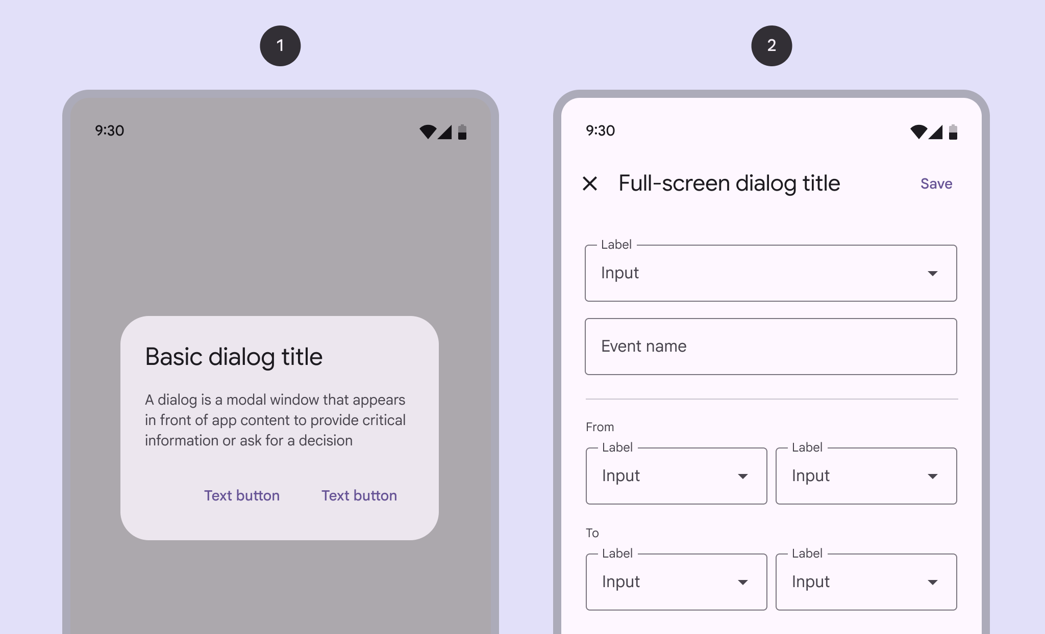
- Basic dialog
- Full-screen dialog
Note: Images use various dynamic color schemes.
Design & API documentation
Anatomy
Basic dialogs
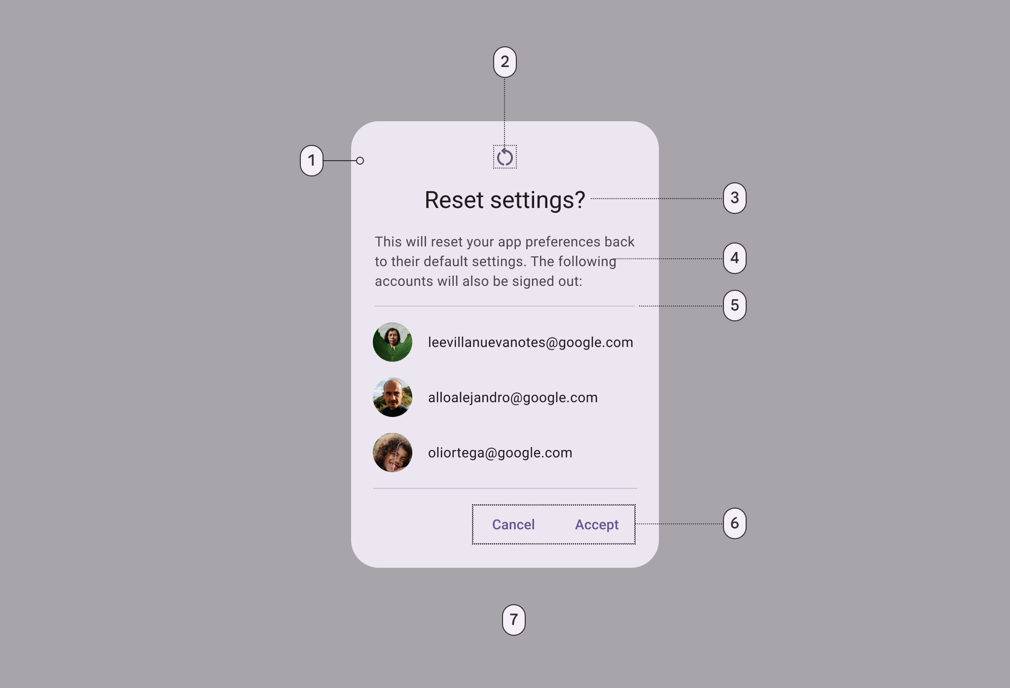
- Container
- Icon (optional)
- Headline
- Supporting text
- Divider (optional)
- Button (label text)
- Scrim
Full-screen dialogs
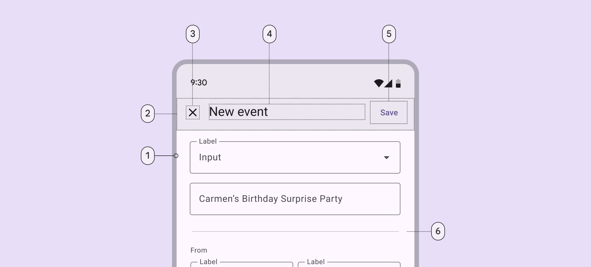
- Container
- Header
- Icon (close affordance)
- Header
- Text button
- Divider (optional)
More details on anatomy items in the component guidelines.
Key properties
Container attributes
| Element | Attribute | Related methods | Default value |
|---|---|---|---|
| Color | app:backgroundTint |
N/A | ?attr/colorSurfaceContainerHigh |
| Shape | app:shapeAppearanceapp:shapeAppearanceOverlay |
N/A | ?attr/shapeAppearanceCornerExtraLarge |
| Background inset start and end | app:backgroundInsetStartapp:backgroundInsetEnd |
setBackgroundInsetStartsetBackgroundInsetEnd |
24dp |
| Background inset top and bottom | app:backgroundInsetTopapp:backgroundInsetBottom |
setBackgroundInsetTopsetBackgroundInsetBottom |
80dp |
Title attributes
| Element | Attribute | Related methods | Default value |
|---|---|---|---|
| Text label | N/A | setTitlesetCustomTitle |
null |
| Text color | android:textColor |
N/A | ?attr/colorOnSurface |
| Typography | android:textAppearance |
N/A | ?attr/textAppearanceHeadlineSmall |
| Icon | N/A | setIconsetIconAttribute |
null |
| Icon tint | app:tint |
N/A | ?attr/colorSecondary |
Content attributes
Supporting text
| Element | Attribute | Related methods | Default value |
|---|---|---|---|
| Text | N/A | setMessage |
null |
| Color | android:textColor |
N/A | ?attr/colorOnSurfaceVariant |
| Typography | android:textAppearance |
N/A | ?attr/textAppearanceBodyMedium |
List item
| Element | Attribute | Related methods | Default value |
|---|---|---|---|
| List item layout | app:listItemLayout |
setItems |
@layout/mtrl_alert_select_dialog_item |
| List item layout style | N/A | N/A | ?attr/materialAlertDialogBodyTextStyle |
| List item text color | android:textColor |
N/A | ?attr/colorOnSurfaceVariant |
| List item typography | android:textAppearance |
N/A | ?attr/textAppearanceBodyMedium |
| Multi choice item layout | app:multiChoiceItemLayout |
setMultiChoiceItems |
@layout/mtrl_alert_select_dialog_multichoice |
| Single choice item layout | app:singleChoiceItemLayout |
setSingleChoiceItems |
@layout/mtrl_alert_select_dialog_singlechoice |
| Multi/single choice item style | android:checkedTextViewStyle |
N/A | @style/Widget.Material3.CheckedTextView |
| Multi/single choice item text color | android:textColor |
N/A | ?attr/colorOnSurfaceVariant |
| Multi/single choice item typography | android:textAppearance |
N/A | ?attr/textAppearanceBodyLarge |
Note: You can set any custom view to be the content of your dialog via the
setView method.
Buttons attributes
| Element | Attribute | Related methods | Default value |
|---|---|---|---|
| Buttons theme attributes (negative/positive) | app:buttonBar*ButtonStyle |
N/A | @style/Widget.Material3.Button.TextButton.Dialog |
| Buttons theme attributes (neutral) | app:buttonBarNeutralButtonStyle |
N/A | @style/Widget.Material3.Button.TextButton.Dialog.Flush |
| Buttons (neutral/negative/positive) | N/A | set*Button |
null |
| Icons | N/A | set*ButtonIcon |
null |
For specific button attributes, see the Buttons documentation.
Scrim attributes
| Element | Attribute | Related methods | Default value |
|---|---|---|---|
| Dim amount | android:backgroundDimAmount |
N/A | 32% |
Theme overlays
| Element | Theme overlay | Description | Attribute |
|---|---|---|---|
| Default theme overlay | ThemeOverlay.Material3.MaterialAlertDialog |
Dialogs have start-aligned icons and titles with end-aligned buttons | ?attr/materialAlertDialogTheme |
| Centered theme overlay | ThemeOverlay.Material3.MaterialAlertDialog.Centered |
Dialogs have center-aligned icons and titles with end-aligned buttons | NA |
Theme attributes
| Element | Theme attribute | Default value |
|---|---|---|
| Default style | ?attr/alertDialogStyle |
@style/MaterialAlertDialog.Material3 |
| Title text style | ?attr/materialAlertDialogTitleTextStyle |
@style/MaterialAlertDialog.Material3.Title.Text |
| Supporting text style | ?attr/materialAlertDialogBodyTextStyle |
@style/MaterialAlertDialog.Material3.Body.Text |
For the full list, see styles, attributes, and theme overlays.
Variants of dialogs
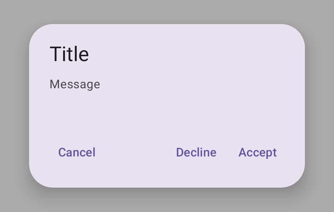
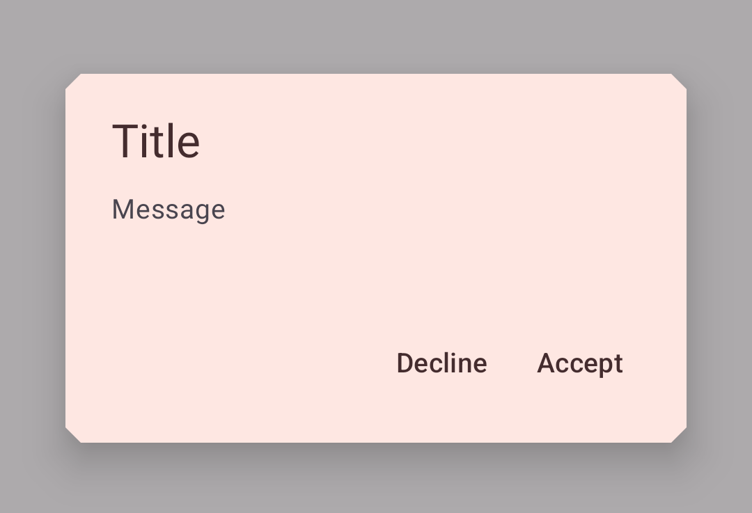
Basic dialog
Basic dialogs interrupt users with urgent information, details, or actions. Common use cases for basic dialogs include alerts, quick selection, and confirmation.
The following example shows a basic dialog.
In code:
MaterialAlertDialogBuilder(context)
        .setTitle(resources.getString(R.string.title))
        .setMessage(resources.getString(R.string.supporting_text))
        .setNeutralButton(resources.getString(R.string.cancel)) { dialog, which ->
            // Respond to neutral button press
        }
        .setNegativeButton(resources.getString(R.string.decline)) { dialog, which ->
            // Respond to negative button press
        }
        .setPositiveButton(resources.getString(R.string.accept)) { dialog, which ->
            // Respond to positive button press
        }
        .show()
Full-screen dialog
Full-screen dialogs fill the entire screen, containing actions that require a series of tasks to complete. One example is creating a calendar entry with the event title, date, location, and time.
Because they take up the entire screen, full-screen dialogs are the only dialogs over which other dialogs can appear.
There is no specific Material implementation of a full-screen dialog. You can
implement it by using a
DialogFragment
as explained in the
Android Developer guides.
Code implementation
Before you can use Material dialogs, you need to add a dependency to the Material components for Android library. For more information, go to the Getting started page.
Dialogs example
Dialogs provide important prompts in a user flow.
A dialog is a type of modal window that appears in front of app content to provide critical information or ask for a decision. Dialogs disable all app functionality when they appear, and remain on screen until confirmed, dismissed, or a required action has been taken.
Dialogs are purposefully interruptive, so they should be used sparingly.
MaterialAlertDialogBuilder(context)
    // Add customization options here
    .show()
Making dialogs accessible
The contents within a dialog should follow their own accessibility guidelines,
such as an icon on a title having a content description via the
android:contentDescription attribute set in the
MaterialAlertDialog.Material3.Title.Icon style or descendant.
Customizing dialogs
Theming dialogs
Dialogs support the customization of color, typography, and shape.
Dialog theming example
API and source code:
MaterialAlertDialogBuilder
The following example shows a dialog with Material theming.
Implementing dialog theming
Setting the theme attribute materialAlertDialogTheme to your custom
ThemeOverlay will affect all dialogs.
In res/values/themes.xml:
<style name="Theme.App" parent="Theme.Material3.*">
  ...
  <item name="materialAlertDialogTheme">@style/ThemeOverlay.App.MaterialAlertDialog</item>
</style>

<style name="ThemeOverlay.App.MaterialAlertDialog" parent="ThemeOverlay.Material3.MaterialAlertDialog">
    <item name="colorPrimary">@color/shrine_pink_100</item>
    <item name="colorSecondary">@color/shrine_pink_100</item>
    <item name="colorSurface">@color/shrine_pink_light</item>
    <item name="colorOnSurface">@color/shrine_pink_900</item>
    <item name="alertDialogStyle">@style/MaterialAlertDialog.App</item>
    <item name="materialAlertDialogTitleTextStyle">@style/MaterialAlertDialog.App.Title.Text</item>
    <item name="buttonBarPositiveButtonStyle">@style/Widget.App.Button</item>
    <item name="buttonBarNegativeButtonStyle">@style/Widget.App.Button</item>
</style>
In res/values/styles.xml:
<style name="MaterialAlertDialog.App" parent="MaterialAlertDialog.Material3">
    <item name="shapeAppearance">@style/ShapeAppearance.App.MediumComponent</item>
    <item name="shapeAppearanceOverlay">@null</item>
</style>

<style name="MaterialAlertDialog.App.Title.Text" parent="MaterialAlertDialog.Material3.Title.Text">
     <item name="android:textColor">@color/shrine_pink_900</item>
</style>

  <style name="Widget.App.Button" parent="Widget.Material3.Button.TextButton.Dialog">
    <item name="android:textColor">@color/shrine_pink_900</item>
  </style>

<style name="ShapeAppearance.App.MediumComponent" parent="ShapeAppearance.Material3.MediumComponent">
    <item name="cornerFamily">cut</item>
    <item name="cornerSize">8dp</item>
</style>
Or if you want to change only one specific dialog, pass the themeResId to the
constructor:
MaterialAlertDialogBuilder(context,  R.style.ThemeOverlay_App_MaterialAlertDialog)
        ...
        .show()